Interneuro+
Is a responsive web-app to help neurodiverse and neurotypical friends, family & partners to have better relationships.
About
Personal UX Project
My Role
UX Designer
Time
3 months part-time
Tools
Figma

Centiment
User Interviews
Google Meet

The Background Story
Recognizing a gap in the market, it became clear that there are almost no resources available for neurotypical and neurodiverse couples, as well as other types of interneuro relationships. This app was created to fill that need and provide support for those navigating these unique dynamics.
What is Interneuro+?
After completing a degree in Psychology, I changed direction from training to be a medical professional, into design work.
For this project I worked with a private tutor & mentor to enhance my design thinking process skills.
Design Process
1
2
3
4
Design thinking is not a linear process, and any stage can feed back to another e.g. after user testing, I often go back to prototyping based on insights
7
6
5
1
Discovery
Competitive Analysis
Survey
Interviews
Top Insights:
- No real competitors in this space
- I explored non-direct competitor apps shown to the right
Competitive Analysis
Non-direct Competitors
| App | Function | Objective |
| Fabriq | Reminders | Maintaining relationships by using reminders |
| Blausm | Social | Connecting local neurodiverse families for support systems |
| Couply | Relationship Help | Enhance communication, understanding, and relationship satisfaction between NT couples |
Competitive Analysis Conclusions
Competition
There are no competitors
Specialized Help
There are no apps that offer direct forum access to specialized experts in things like ADHD, Autism.
Restrictions:
Limited unpaid features and heavy reliance on partner participation to reach objectives
Poor Marketing
Except for Couply, these apps didn’t really have much of a social media presence and there was no other evidence of marketing
One Function
Most of the apps only have 1 main function like Fabriq with reminders
Survey and interview research goals
Goal 1
Documenting user pain points in interneuro relationships
Goal 2
To determine if users have a need for an Interneuro app
Goal 3
Collecting data on the context in which users would use an Interneuro app
Goal 4
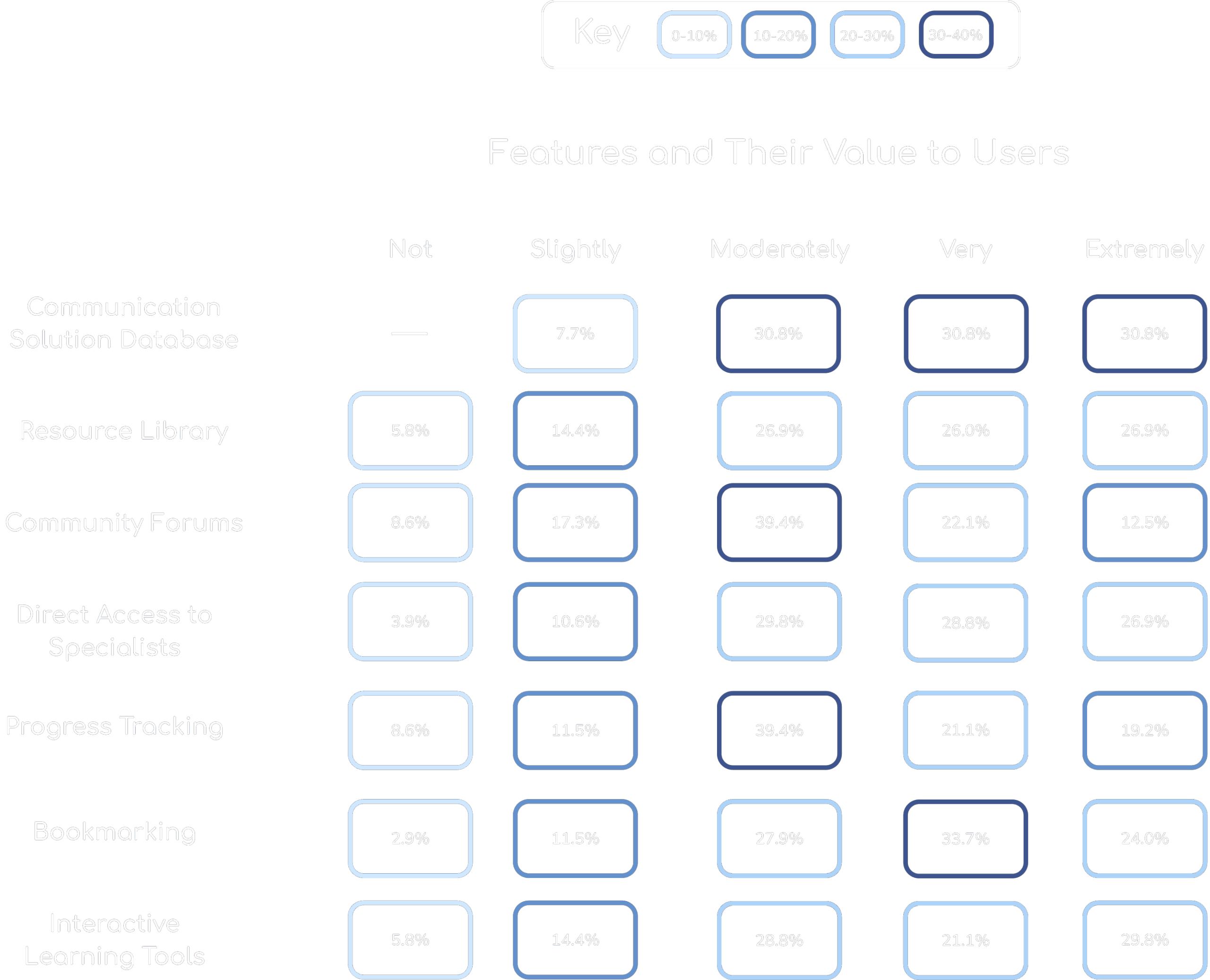
To determine what features and content are important to users
Goal 5
Collecting information on how users prefer to learn about relationships
Survey
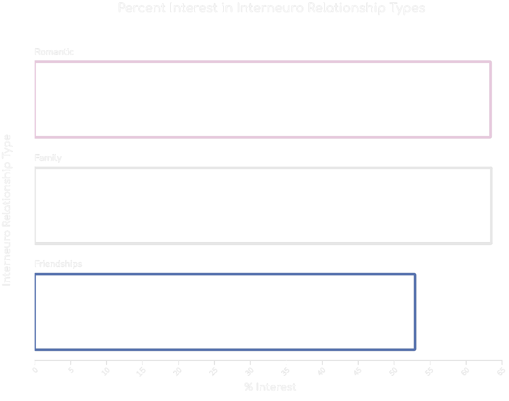
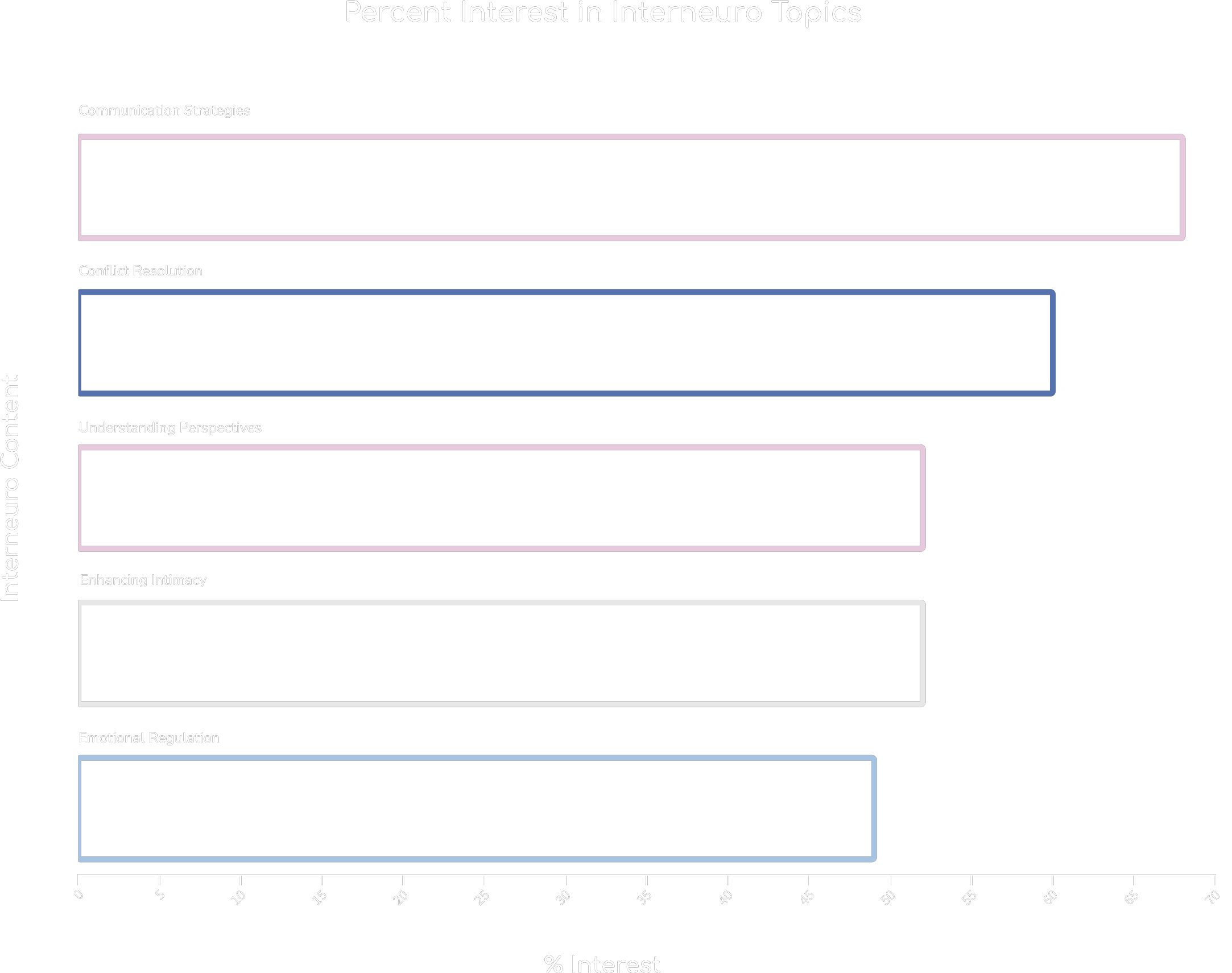
I conducted a survey via centiment to understand more about people’s pain points in interneuro communication and relationships and their preferences towards fixing them.
100% of survey participants are in interneuro relationships (romantic, platonic, family, or work)

90.5%

58%
Survey
Survey
Interview Demographics
I conducted a survey via centiment to understand more about people’s pain points in interneuro communication and relationships and their preferences towards fixing them.
7 Survey participants
100% of survey participants are in interneuro relationships (romantic, platonic, family, or work)
Neurotypes
Neurotypical: 3
Neurodivergent: 4
Technical Proficincy
Average rating: 3.75/5
Life Stages
Interviews
I conducted 7 interviews with potential users. The selection criteria were based on neurotype, relationship type, and age. The results were analyzed using Affinity Mapping.
Lack of Resources
“There are plenty of resources for neurotypicals, but not enough for neurodivergents or for neurotypicals to understand them.”
“I wish there was a resource that could help us with our specific challenges, but I don’t even know what to look for.”
“It’s hard to find resources tailored to new relationships with kids involved.”
“There’s a lack of community and support for people in interneuro relationships”
“Most apps I’ve used are too general—they don’t address my specific needs or circumstances.”
“I can’t find tools to help us manage the small day-to-day issues—it’s all big-picture advice.”
“Everything online feels either overly simplified or too complex—there’s no middle ground.”
Ideal Features
“A platform with community forums, articles, personal tips, and videos for both NTs and NDs.”
“A quiz or feedback tool where users can apply and reflect on what they learned.”
“Interactive learning tools are preferred because they support better retention and application.”
“A variation of video lengths (short and longer) lets users choose how deeply to engage.”
“Scientific research combined with practical tips makes advice more actionable and reliable.”
“Personal stories or written POVs from partners help bridge understanding gaps.”
“Access to mediators or therapists for resolving interpersonal challenges in real-time.”
Frustrations
“When apps push ads or ask you to pay frequently, it disrupts the user experience.”
“Cluttered interfaces and poor navigation prevent users from completing tasks efficiently.”
“Frequent notifications and emails every day become overwhelming.”
“Apps are often slow or glitchy, making them frustrating to use.”
Accessibility
“Subtitles and reminders are helpful but not overwhelming with pop-ups.”
“Dark mode, subtitles, and the ability to stop in the middle of content are important.”
“Simple navigation menus and designs help anyone figure out how to use the app.”
What participants said...
This would’ve been super helpful at the beginning of my sons autism journey
I would definitely use it, the AI Coach feature would be so helpful
I love that you can gauge your progress

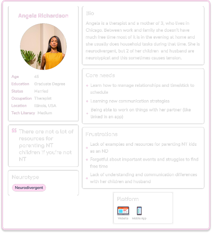
Angela, 45
Therapist, Illinois

Ethan, 25
Scientist, Oregon

Divya, 31
Retail, New York
Interview Insights
Lack of Resources
Participants struggled to find tailored resources addressing their needs, such as guidance for mixed-neurotype relationships. They felt tools were too generalized and failed to offer actionable advice for niche challenges, leaving them without clear solutions.
Clear and Tailored Advice
Personalized advice was seen as essential for user trust and engagement. Real-time communication, like chat or live sessions, made users feel supported, while progress tracking helped show measurable improvement, reinforcing the tool’s value.
Accessibility
Accessibility features like dark mode, subtitles, and simple navigation were highly valued. These tools ensured usability for a broader audience, reducing barriers for users with neurodivergence or varying technical proficiency.
General App Frustrations
Users disliked slow, cluttered, or glitchy apps that made tasks harder. Notifications and ads often disrupted their experience, while poorly organized features caused confusion and made users feel unsupported.
Motivations
Participants valued progress tracking and gamification features like badges or streaks to keep them motivated. These tools made the app feel rewarding and encouraged consistent use while balancing fun with functionality.
Communication Tools
Participants emphasized the importance of features that foster better communication between NTs and NDs. Tools like conversation starters, role-playing scenarios, or communication style quizzes were seen as effective for helping users understand and navigate interpersonal dynamics.
2
Understanding User Needs
User Personas
User Flow
Marketing to PDA Individuals
Pathological Demand Avoidance (PDA) is a profile on the autism spectrum, characterized by an extreme avoidance of everyday demands and expectations, driven by high levels of anxiety.
Understanding Unique Needs
Non-Intrusive Content Suggestions
Offering Choice and Control
Building Trust
User Personas
Use the arrow or click a persona card to view the next one
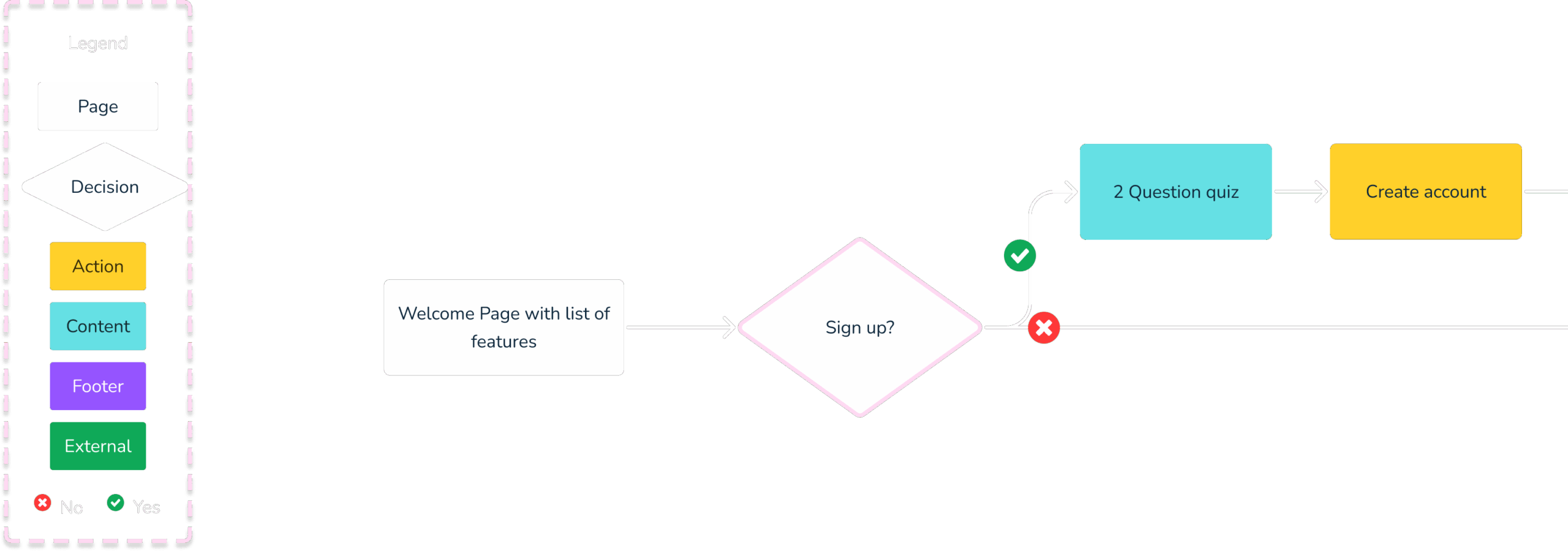
User Flows
Click and drag to explore the user flow. Pinch or scroll to zoom in and out.
3
Ideation
Information Architecture
Card Sorting
Site Map
Information Architecture
Book a session with a specialist
AI Coach / Mediator
Education
Community Forums
Customizable Dashboard
Save for later
Card Sorting
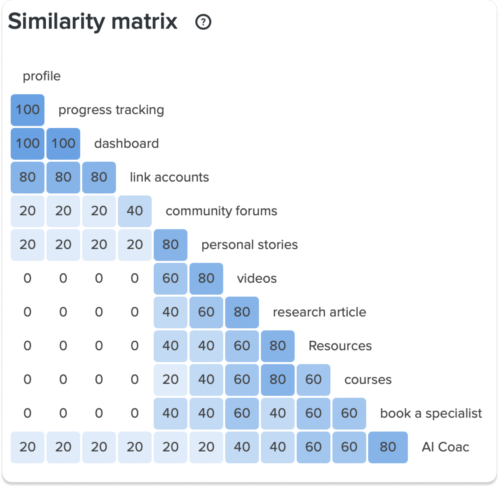
The results revealed clear patterns in how users perceive and group these features. For instance, “profile,” “progress tracking,” and “dashboard” were consistently grouped together, each scoring 100 in similarity, indicating a strong correlation in their perceived functionality.
“Link accounts” also showed high similarity with these features, scoring 80. Features such as “personal stories,” “videos,” and “research articles” displayed moderate similarities ranging from 60 to 80, suggesting some overlap in user expectations.
Conversely, “community forums” and “AI Coach” exhibited lower similarity scores, highlighting their distinct roles within the platform.
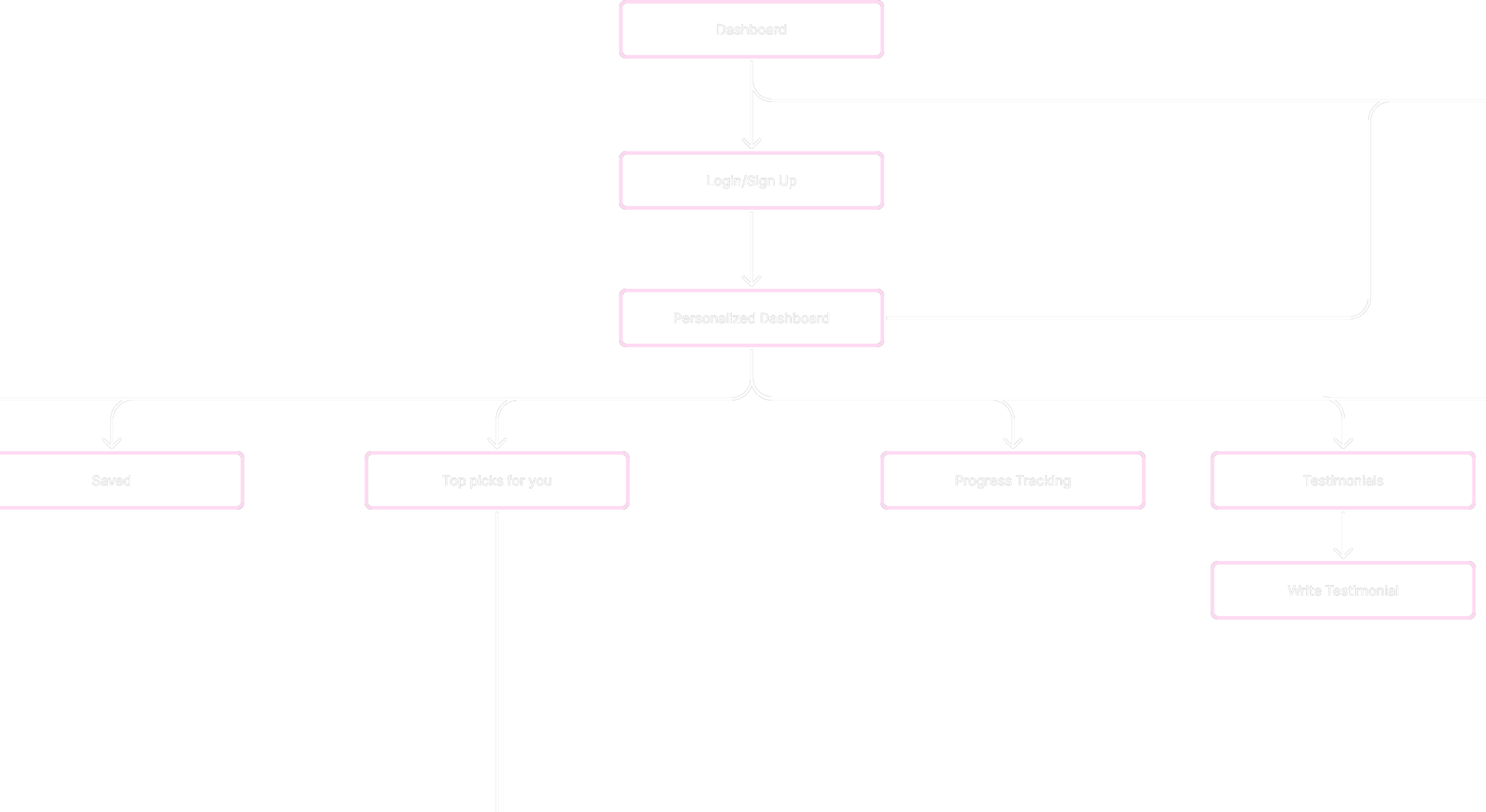
Site Map of Interneuro+
4
Prototype
Low-Fidelity
Mid-Fidelity
Iteration Process
Task Flow - Courses Page
The course area allows users to explore content through predefined categories, keyword searches, and filtering options, ensuring quick and relevant access.
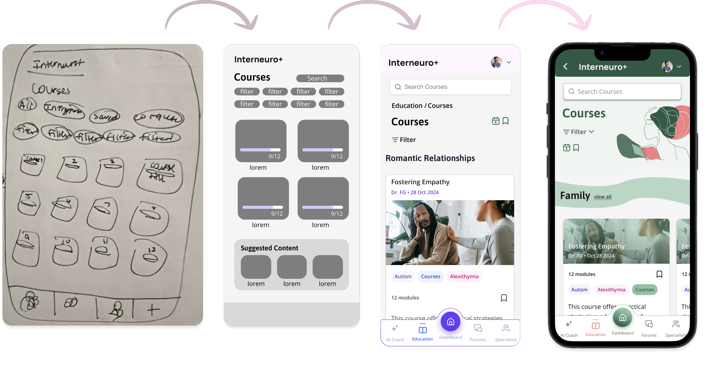
Low-Fidelity Wireframes
Task Flow - Start a Course
- Starting from the dashboard, users navigate to the Resources/Education section and then into Courses.
- From there, they can filter by predefined categories like “ADHD” or “Parenting” and select a course.
- Within each course, users can choose activities such as videos, games, short readings, or quizzes in any order, like the “Empathy Builder” game.
- Completed courses are marked in the interface to track user progress.

Mid-Fidelity Wireframes
Task Flow - Filtering Courses
Users can filter courses by selecting topics, and the content dynamically updates to display relevant results.

Clickable Mid-Fidelity Prototype
Click around the user testing prototype yourself here.

5
User Testing
User Testing Scenarios
User Testing
Preference Testing
User Testing Scenarios
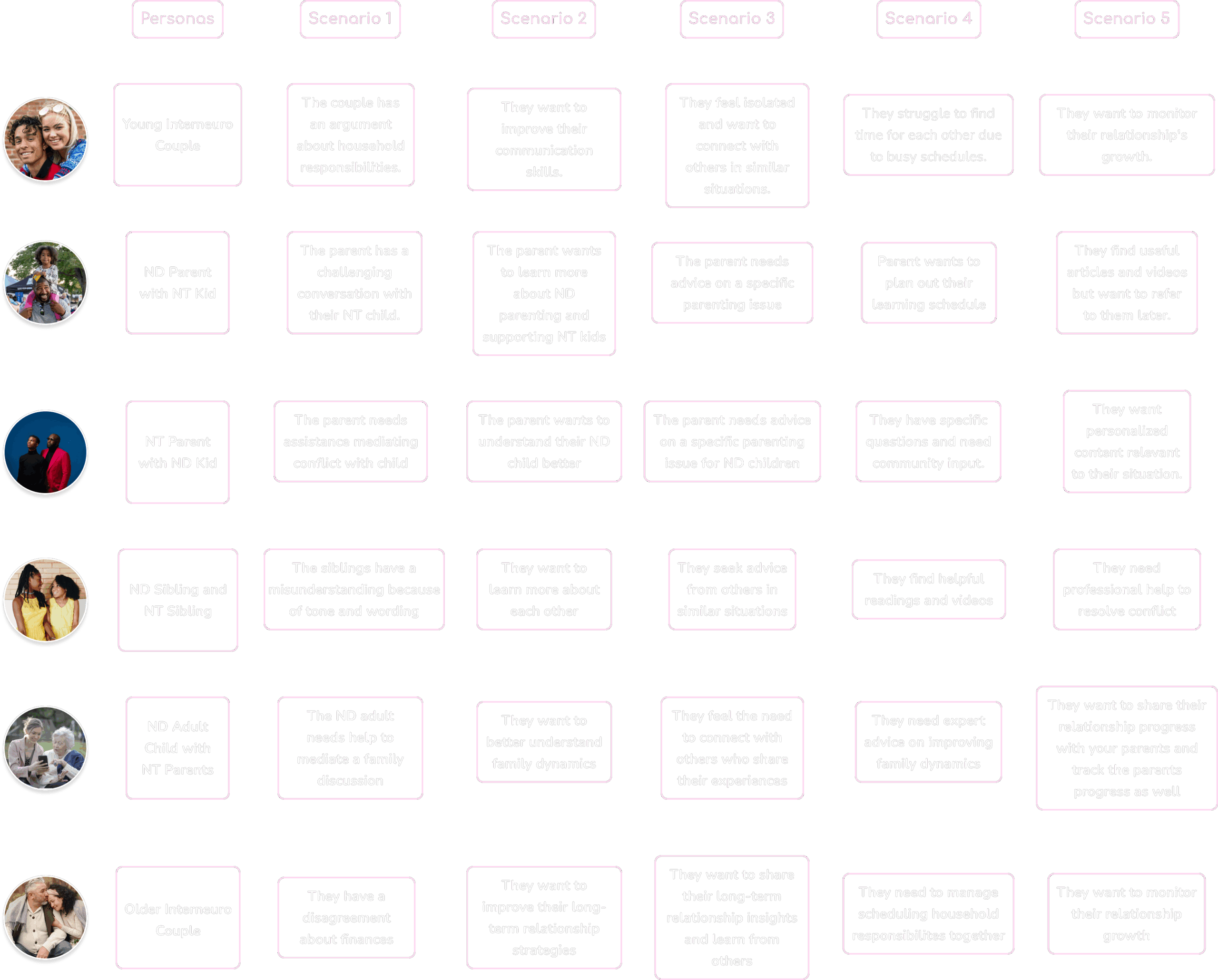
These personas and scenarios were selected to represent key segments of the target market and address a variety of expected pain points and use cases. Each scenario highlights real-world challenges users might face, ensuring the design focuses on their needs and priorities.
User Testing
I conducted user testing interviews via user interviews to explore how individuals interact with the app and identify pain points in its usability.
Below are some surprising findings from these sessions.
8 User testing participants
100% of survey participants are in interneuro relationships (romantic or family)
75%
were confused on how progress is being tracked
63%
think pressing “clear all x” will close the filter
Rainbow Spreadsheet
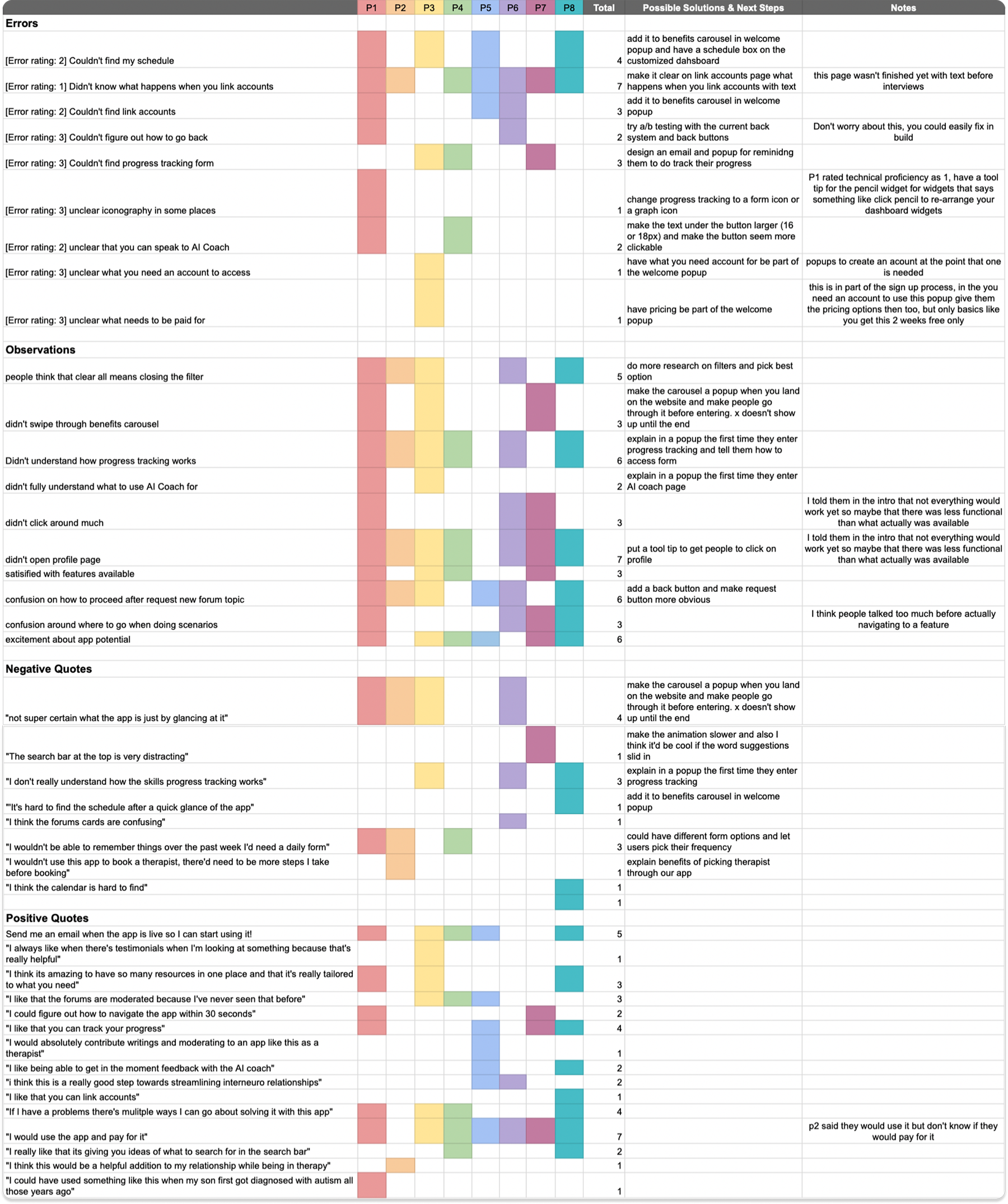
User testing findings were documented and analyzed using a rainbow spreadsheet, a color-coded tool in UX design that organizes user feedback, errors, and observations across participants.
This method helps identify common issues, their severity, and the number of user types affected. The structured analysis provided clear insights to prioritize problems and guided the development of targeted solutions to enhance usability and user experience.
Observations
Thinking
people think that clear all means closing the filter
P1, P2, P3, P6, P8
confusion around where to go when doing scenarios
P1, P2, P3, P6, P8
Doing
didn’t swipe through benefits carousel
P1, P3, P7
didn’t click around much
P1, P6, P7
didn’t open profile page
P1, P2, P3, P4, P6, P8
Feeling
excitement about app potential
P1, P3, P4, P5, P7, P8
satisified with features available
P1, P3, P4, P7
confusion on how to proceed after request new forum topic
P1, P2, P3, P5, P6, P8
Didn’t understand how progress tracking works
P1, P2, P3, P4, P6, P8
Quotes & Errors
Positive
“Send me an email when the app is live so I can start using it!”
P1, P3, P4, P5, P8
“I would use the app and pay for it”
P1, P3, P4, P5, P6, P7, P8
“I think it’s amazing to have so many resources in one place and that it’s really tailored to what you need”
P1, P3, P8
“If I have a problems there’s mulitple ways I can go about solving it with this app”
P1, P3, P4, P8
“I could figure out how to navigate the app within 30 seconds”
P1, P7
“I would absolutely contribute writings and moderating to an app like this as a therapist”
P5
“I like being able to get in the moment feedback with the AI coach”
P5, P8
“I like that you can track your progress”
P1, P5, P7, P8
“i think this is a really good step towards streamlining interneuro relationships”
P5, P6
“I always like when there’s testimonials when I’m looking at something because that’s really helpful”
P3
“I really like that its giving you ideas of what to search for in the search bar”
P4, P8
Negative
“Not super certain what the app is just by glancing at it”
P1, P2, P3, P6
“The search bar at the top is very distracting”
P7
“I don’t really understand how the skills progress tracking works”
P3, P6, P8
“It’s hard to find the schedule after a quick glance of the app”
P8
“I wouldn’t be able to remember things over the past week I’d need a daily form”
P1, P2, P4
“I think the forums cards are confusing”
P6
“I think the courses are too long”
P2
“I think the calendar is hard to find”
P8
“I wouldn’t use this app to book a therapist, there’d need to be more steps I take before booking”
P2
Errors
Couldn’t find my schedule feature
P1, P3, P5, P8
Didn’t know what happens when you link accounts
P1, P2, P4, P5, P6, P7, P8
Couldn’t find link accounts
P1, P5, P6
Couldn’t figure out how to go back
P1, P6
Couldn’t find progress tracking form
P3, P4, P7
Unclear iconography in some places
P1
Unclear that you can speak to AI Coach
P1, P4
Unclear what you need an account to access
P3
Unclear what needs to be paid for
P3
Features
Participants rate how useful features were to them
86.3%
My Schedule
83.8%
Link Accounts
83.8%
Community Forums
75%
Book a session with a specialist
86.3%
Save for later
76.3%
AI Coach / Mediator
82.5%
Progress Tracking
82.5%
Education
6
UI Design
Final Screens

Final Screens
Welcome Popup
- The onboarding asks if the user is neurotypical or neurodivergent to personalize the app experience.
- An animation highlights relationship types for neurodivergent users, keeping the process simple and engaging.
- The design ensures a quick, frictionless sign-up while adding personalization to the home screen.

Final Screens
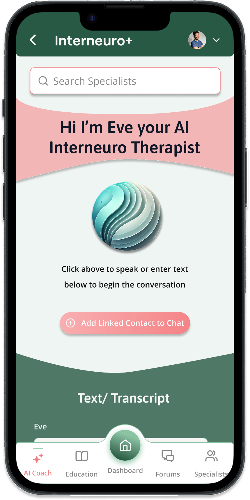
AI Therapist
- Research revealed users seek quick, personalized help for conflict resolution.
- Provides 24/7 accessible support with practical advice and tools.
- Designed to improve communication and emotional understanding.
Final Screens
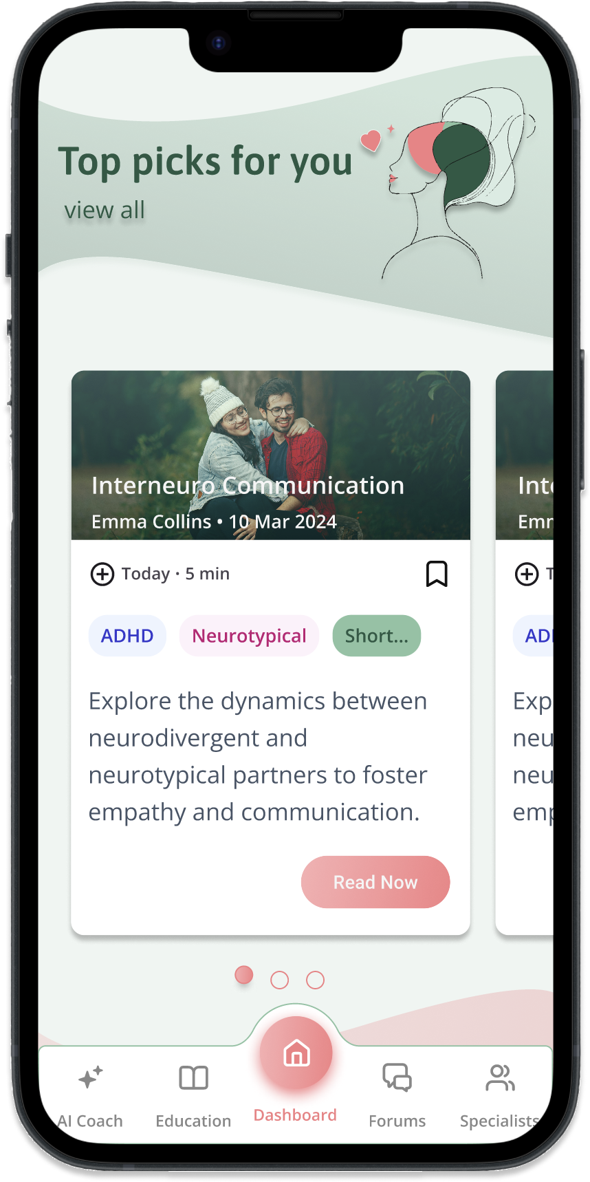
Customizable Dashboard
- Research showed users value simplicity and dislike cluttered interfaces.
- The dashboard allows users to toggle features and customize what appears on their homepage.
- This approach ensures users are aware of all the app’s offerings while providing a tailored and streamlined experience based on their preferences.
7
Reflections
Future Steps
Lessons Learned
Future Steps
With the MVP complete, here are the next steps to bring the app to its full potential:
Refine Designs
Finalize all app screens and interactions to ensure a seamless user experience.
Plan for Development
Explore development options and establish a timeline for turning the designs into a functional app.
Collaborate with Experts
Connect with therapists and mental health professionals to integrate credible insights and support.
Lessons Learned
During the Interneuro+ design process, I encountered key challenges:
Organizing Complex Information
Simplified a multi-layered structure with dynamic filters to improve navigation without clutter.
Feature Placement in Navigation
Used card sorting to clarify where users expected features, creating a more intuitive layout.
Designing Customized Dashboard
Developed a customizable dashboard for a clean, user-friendly experience with personalized options based on data from user interviews
Value of User Interviews and Testing
Learned that gathering feedback from real users through interviews and testing is essential to shaping a user-centered design that meets actual needs.