Research Portfolio
Created a portfolio to showcase Natalie’s chemistry PhD research with a professional, user-friendly design that highlights her work and publications.
About
Internship
My Role
UX Designer
Time
2 years part-time
Tools
Figma

Google Forms
Coolors.com
Google Meet

Whocanuse.com
The Background Story
Natalie was applying to PhD programs in chemistry and needed a website to showcase her research, helping her stand out to admissions committees.
Design Process
1
2
3
4
Design thinking is not a linear process, and any stage can feed back to another e.g. after user testing, I often go back to prototyping based on insights
6
5
1
Discovery
Competitive Analysis
Survey
Interviews
Top Insights:
- Very basic layout and designs
- Poor readability
- Boring
Competitive Analysis
Non-direct Competitors

Survey and interview research goals
Goal 1
Understand what academic audiences (e.g., admissions committees, faculty) look for when reviewing a student’s research portfolio online.
Goal 2
Identify what kind of content (papers, bios, CVs, summaries) is most helpful for showcasing research.
Goal 3
Evaluate how the visual design and layout affects perceived professionalism and credibility.
Goal 4
Learn how easy or difficult users find it to navigate and understand complex scientific information in a portfolio format.
Goal 5
Identify any technical or accessibility preferences that affect usability for academic audiences.
Survey
I conducted a survey via google forms with faculty and academic reviewers to understand what makes a student research portfolio effective, memorable, and easy to evaluate during the PhD admissions process.
10 Survey participants
100% of survey participants have experience in academic review or advising roles

70%

70%
Interview Demographics
I conducted interviews with academic reviewers and admissions staff to understand what makes a student research portfolio effective, easy to navigate, and visually compelling. Their insights helped refine the site’s structure, tone, and content presentation.
3 Interview participants
100% of survey participants have experience in academic review or advising roles
80%
Average rating: 3.75/5
5-12
39-52
Admissions Committee Member, Chemistry Professor, Grad Program Coordinator
Interview Insights
First Impressions Matter
Participants noted that structure, visual layout, and clarity in the first few seconds strongly shaped their impression of the applicant’s professionalism and credibility.
Layout Preferences Are Clear
All participants preferred portfolios with distinct, labeled sections over long scrolling pages. This format made it easier to skim, navigate, and return to key materials.
Clutter Hurts Credibility
Busy visuals, dense text, and poor contrast were flagged as major red flags. A clean layout and sufficient white space helped users stay engaged and informed.
Highlighting Impact is Crucial
Reviewers wanted to see why a student’s research matters—not just what they did. Sites that connected personal motivation or broader relevance stood out more.
Skimmable Summaries Work
Quick previews and visual highlights were essential for understanding projects at a glance. Reviewers appreciated brief write-ups before clicking deeper.
Mobile Isn’t the Priority
All participants reported reviewing portfolios primarily on desktops. Mobile responsiveness was still expected, but not a deciding factor in usability or quality.
2
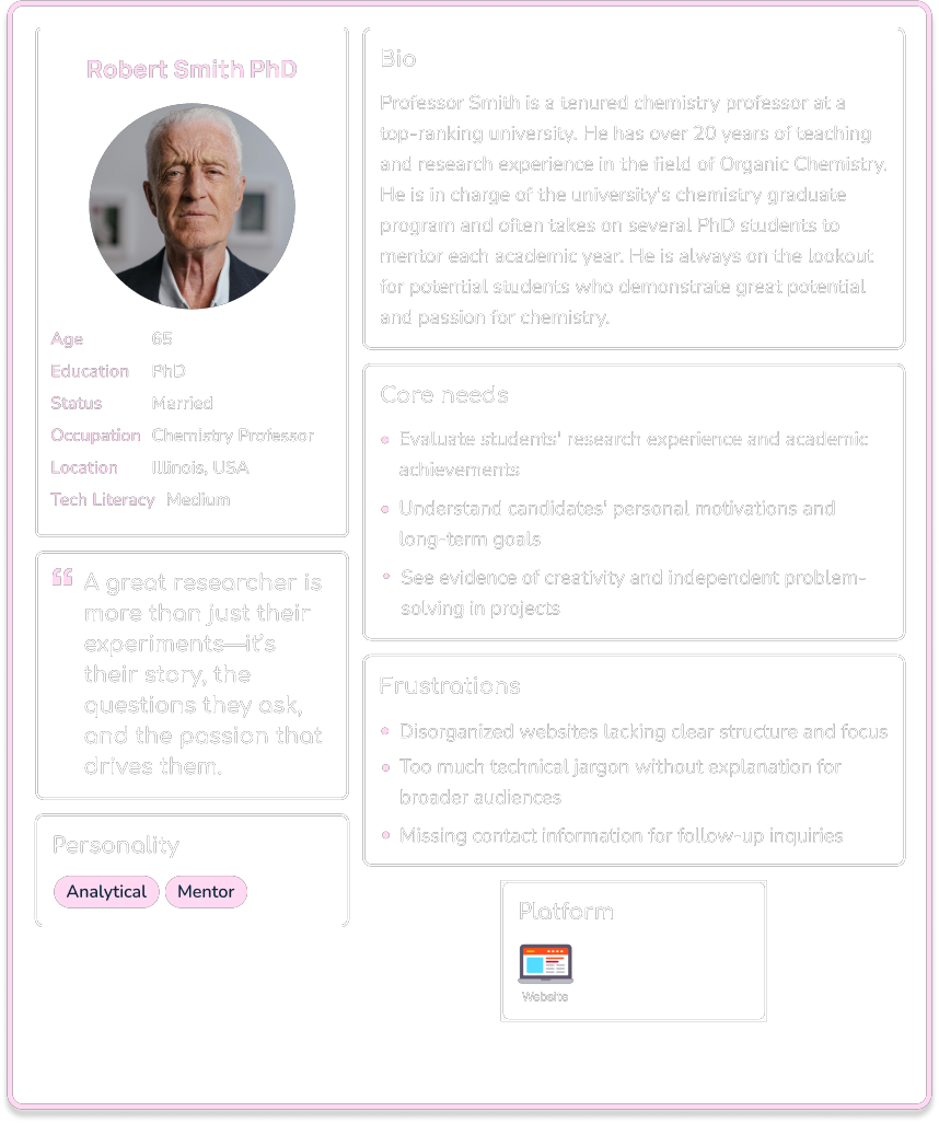
Understanding User Needs
User Persona
User Persona
3
Ideation
Information Architecture
Site Map
Information Architecture
After gathering requirements from the design brief, along with insights from user research conducted through an interview. I developed a list of key app features. These features were then grouped and structured into a site map.
About
Contact
Research
CV
Publications
Site Map

4
Prototype
Low-Fidelity
Mid-Fidelity
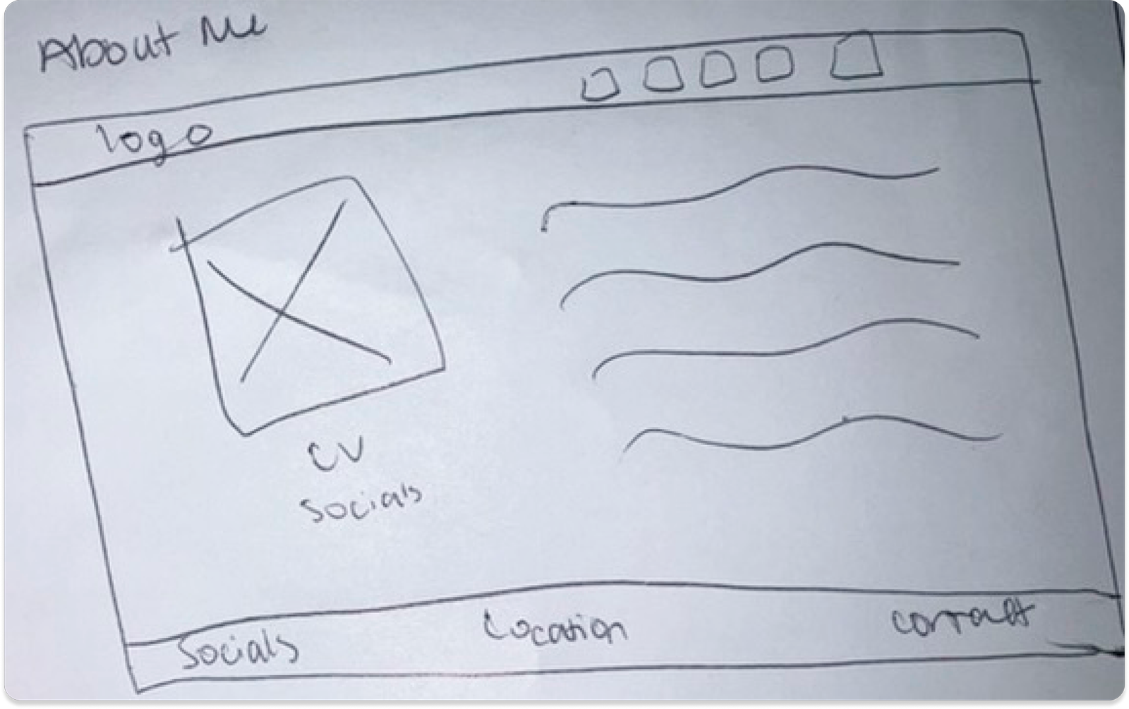
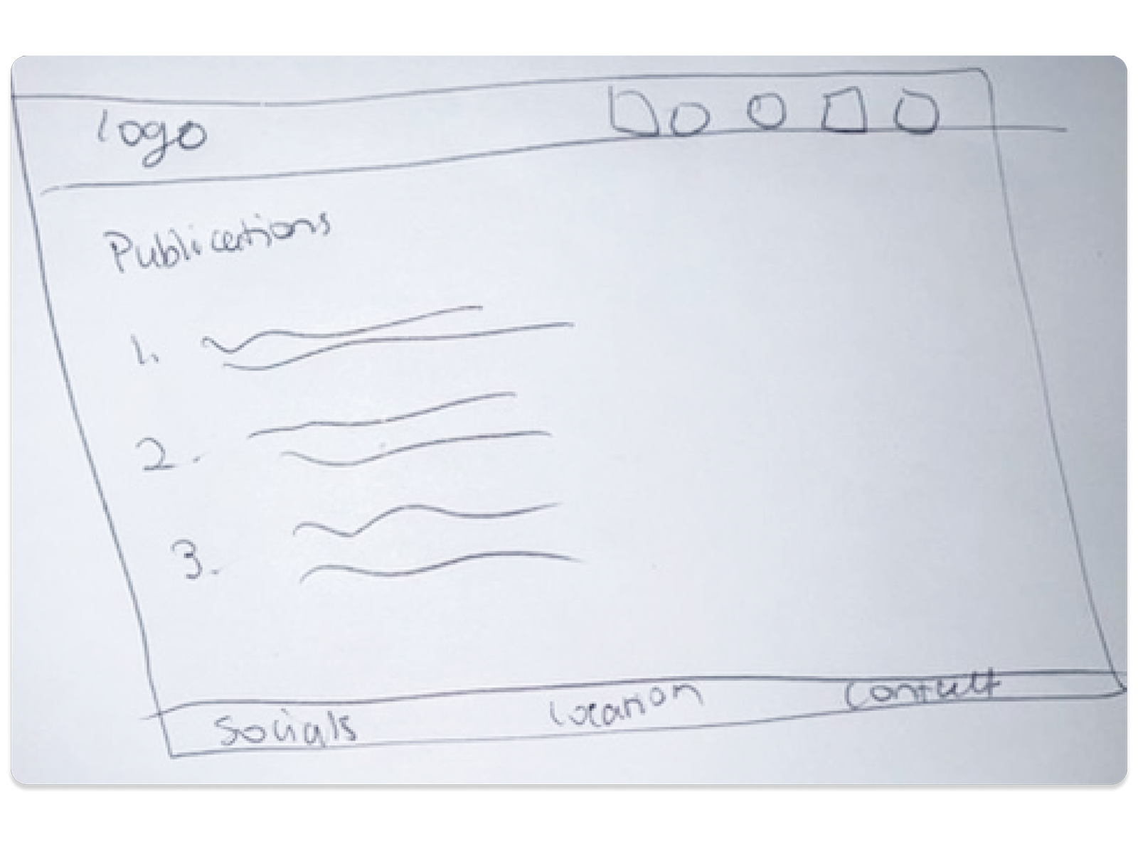
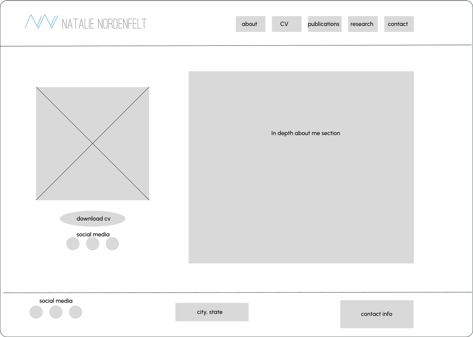
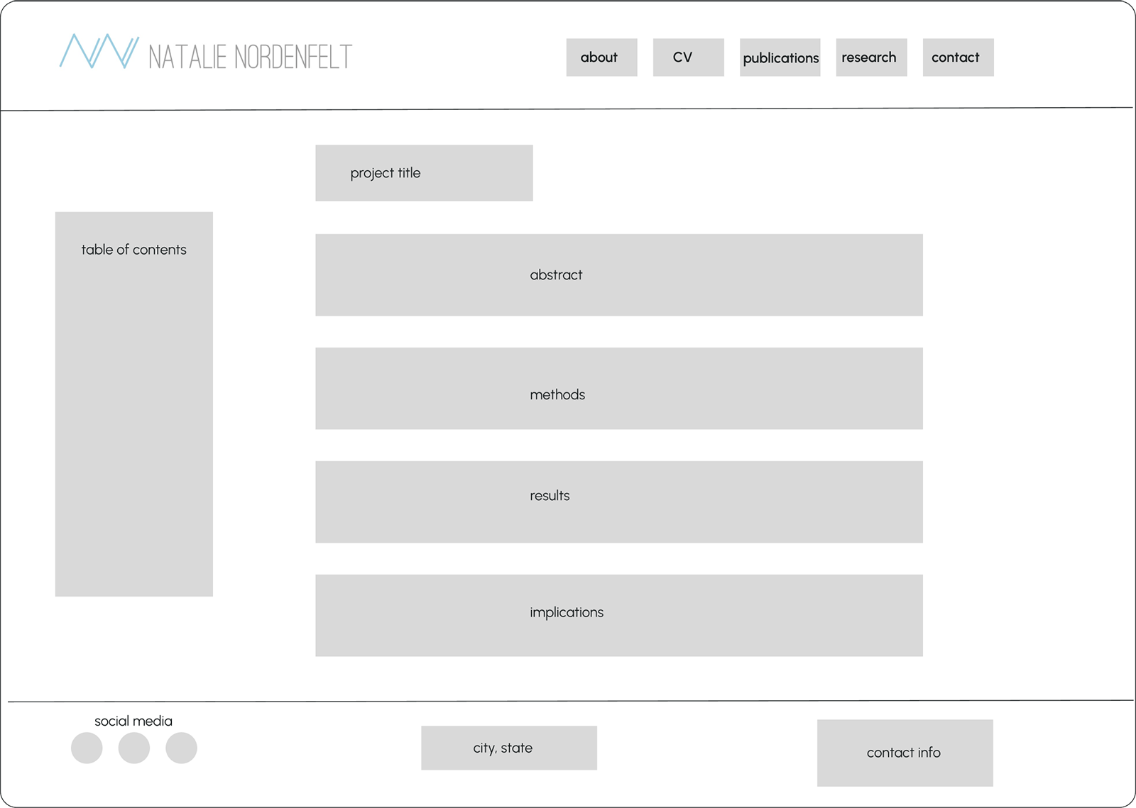
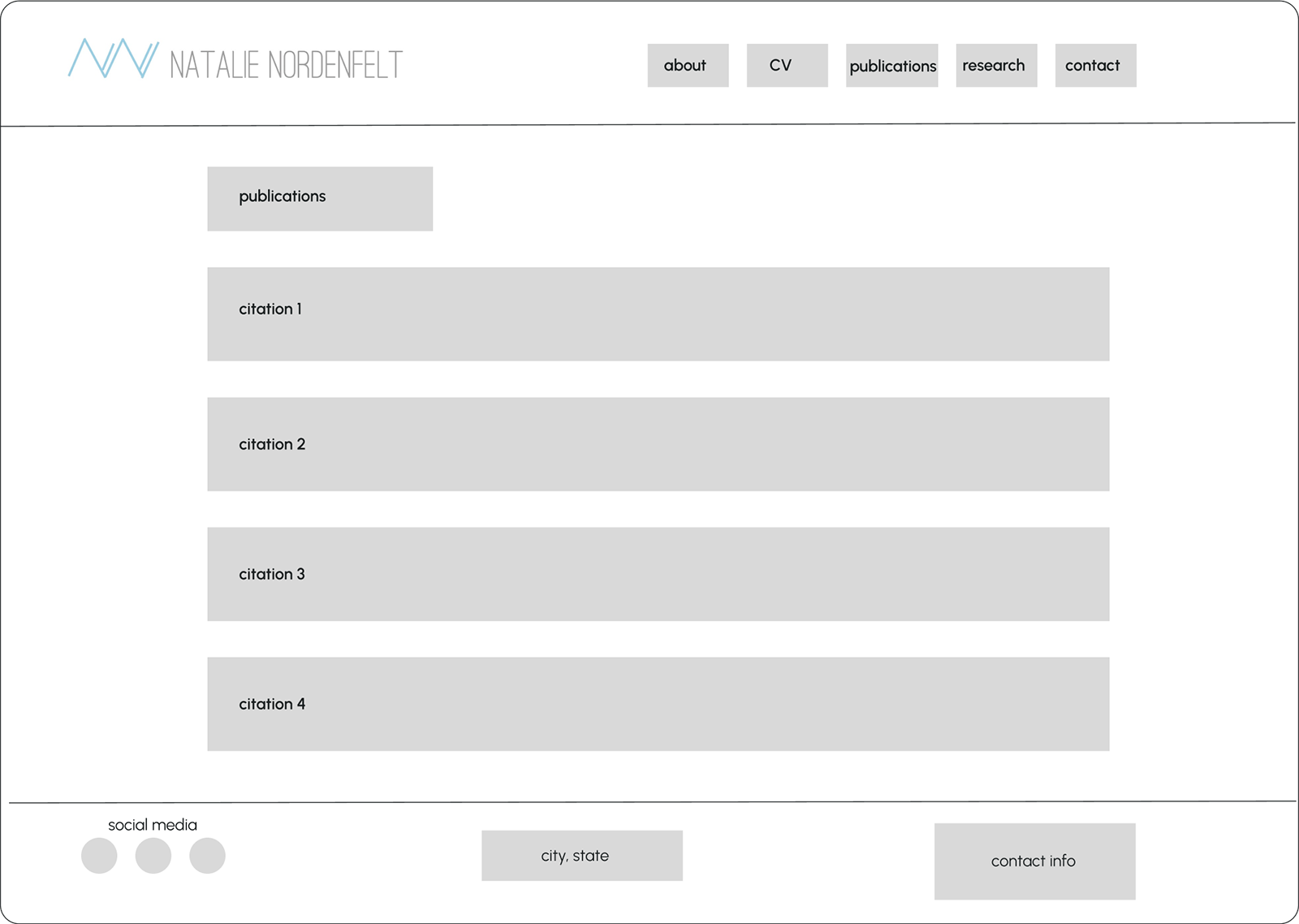
Low-Fidelity Wireframes
Homepage

About Me
Research Project

Publications
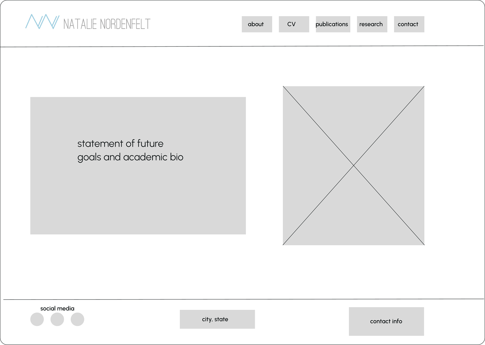
Mid-Fidelity Wireframes
Homepage
About Me
Research Project
Publications
5
UI Design
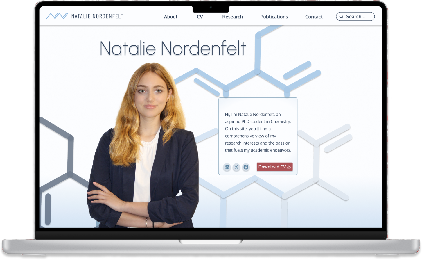
Final Screens
Clickable Prototype
Final Screens
Search Results
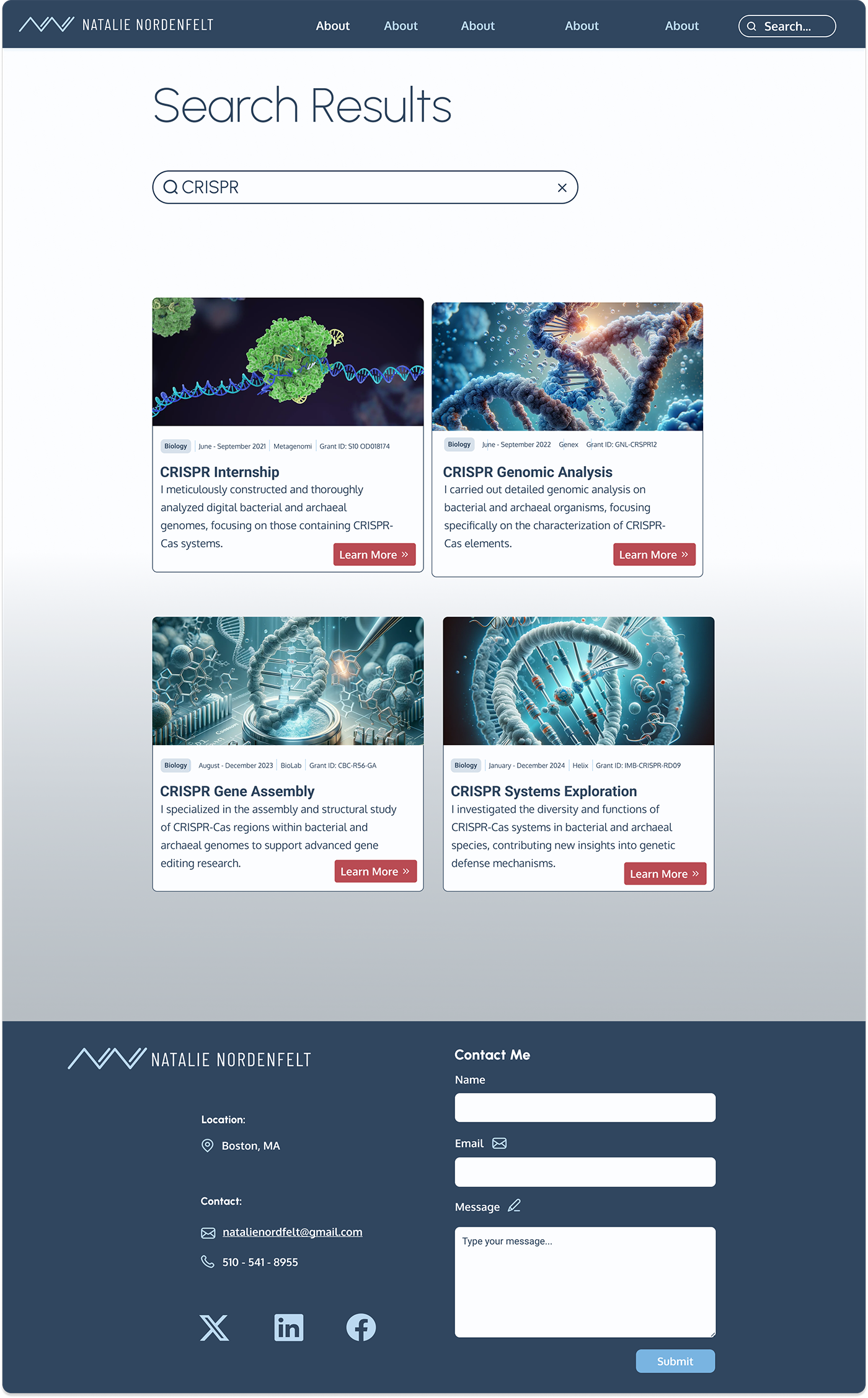
Final Screens
Research

Clickable Prototype
Click around the user testing prototype yourself here.
6
Reflections
Future Steps
Lessons Learned
Future Steps
As this was my first UX/UI project, I believe there are some improvements to be made now that I’ve advanced in my learning:
Refine Designs
Revisit the entire website to incorporate my enhanced design skills, making the layout more intuitive and visually engaging.
Update Visuals
Replace and upgrade photos to improve quality and better align with the website’s tone and purpose.
Collaborate with Experts
Fine-tune spacing for improved readability and visual appeal across all sections, ensuring a polished look.
Lessons Learned
As my first UX/UI project, I encountered many foundational learning moments:
Balancing Professionalism and Creativity
Designing a modern, unique look while maintaining a professional tone gave me firsthand experience in balancing creativity with industry expectations.
Mastering Carousel Animations
Learning to implement carousel animations improved my understanding of interactive design elements, a rewarding technical challenge.
Resourcefulness with Visuals
Limited stock images (pre-AI) taught me to be adaptable and find suitable visuals under constraints—a valuable skill for future projects.
Building a Brand
Experimenting with colors, fonts, and style introduced me to branding, teaching me how to create a cohesive and appealing visual identity.