Retina Care Group
Is a responsive website redesign for a medical practice, focused on improving access, clarity, and ease of use for patients and providers.
About
Internship
My Role
UX Designer
Time
2 years part-time
Tools
Figma

Google Forms
Whocanuse.com
Google Meet

The Background Story
Retina Care Group’s original website was a basic template made when the practice was first founded, and it hadn’t been updated since. Patients often had trouble finding essential information or completing forms—especially older adults and those with cognitive challenges. I saw an opportunity to redesign their digital presence and make their care more approachable and accessible.
Design Process
1
2
3
4
Design thinking is not a linear process, and any stage can feed back to another e.g. after user testing, I often go back to prototyping based on insights
6
5
1
Discovery
Competitive Analysis
Survey
Interviews
Competitive Analysis
| Practice | Retina Associates of Cleveland | The Retina Group | Associated Retinal Consultants |
| Strengths |
|
|
|
| Weaknesses |
|
|
|
| Opportunities |
|
|
|
| Threats |
|
|
|
Competitive Analysis Conclusions
Competition
There are several competitors
Modern Design
Updating the website with a clean, modern look
Mobile Optimization
Ensuring the site is mobile-friendly increases accessibility for patients using phones or tablets.
Patient Care
Educational materials can help patients better prepare for visits and feel more confident in their care.
Online Scheduling
Adding an easy-to-use appointment system makes the site more functional and reduces friction for patients.
Survey and interview research goals
Goal 1
Identify usability issues with the original website and patient forms
Goal 2
Understand patient frustrations and expectations around accessing care information
Goal 3
Evaluate how patients currently interact with intake forms and appointment workflows
Goal 4
Learn which features patients and staff consider most helpful for improving efficiency
Goal 5
Determine how patients access the website (desktop vs mobile) and what devices to prioritize
Survey
I conducted a survey via google forms to better understand Retina Care Group patients’ technology habits and the challenges they face when using medical websites.
150 Survey participants
85% of survey participants were aged 60+; with a large concentration in the 70–79 age range.

72%

70%

65%

50%
Interview Demographics
I conducted interviews with patients from Retina Care Group to understand their digital behaviors, device preferences, and overall comfort navigating medical websites and forms. These insights helped identify accessibility barriers and informed design decisions for the updated patient experience.
20 Interview participants
100% of interview participants are staff or patients
Devices Used
Desktop: 8
Tablet: 5
Laptop: 4
Smartphone: 3
55%
Average rating: 2.2/4
60-84
Patients
Interviews
Participants were asked about how they use the Retina Care Group website, where they run into difficulty, and how they access important care information.
Website Pain Points
“I tried to find the address for the Erie office, but the map wouldn’t load on my phone.”
“The font on the services page is so small; I had to squint to read about macular degeneration.”
“Navigating to the transportation information took me a while; it wasn’t immediately visible.”
Needs
“A clear checklist of what to bring for my first visit would be helpful.”
“Big buttons with simple labels help.”
“The new patient packet being more clearly marked would save time.”
“Information on nearby parking options for each location would ease my planning.”
Alternatives
“I prefer calling the office to schedule appointments; it’s more straightforward for me.”
“Online forms are confusing; I’d rather fill them out in person.”
“I don’t trust online appointment systems; speaking to someone ensures my spot.”
What participants said...
I’m more comfortable just calling the office. If I try to do it online, I’m always worried I’ll skip something important by accident
My eyes aren’t what they used to be — I could barely read the text on the website.
I printed the form and filled it out, but then I just held onto it. I wasn’t sure if I was supposed to bring it in or mail it

Eleanor, 78
Erie, PA

Gerald, 80
Sharon, PA

Margaret, 70
Retail, New York
Interview Insights
Device Challenges
Participants often used smartphones or tablets to access the website, but many struggled with small text, cluttered pages, and unclear clickable elements. Improving text size and link visibility can enhance usability.
Navigation Frustrations
Several participants mentioned confusion due to poorly differentiated links and crowded layouts. Simplifying the interface and using clear, bold headings would help users find what they need more easily.
Preferred Information Sources
Many participants preferred calling the office directly or asking family members for help rather than using the website. Ensuring that critical information is prominently displayed and easy to find online may reduce reliance on phone support.
Form Completion Difficulties
Filling out medical forms at the office was a common pain point. Issues included small font size, cramped text boxes, and uncertainty about required fields. Providing clear guidance and using larger text would reduce frustration.
Suggestions for Improvement
Participants suggested adding more space on forms, clear instructions, larger font sizes, and breaking information into easily digestible sections with colored headings. Allowing patients to complete forms with assistance could also reduce stress.
2
Understanding User Needs
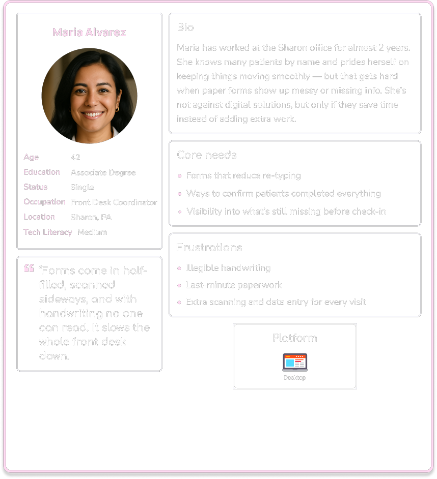
User Personas
User Flow
User Personas
Use the arrow or click a persona card to view the next one
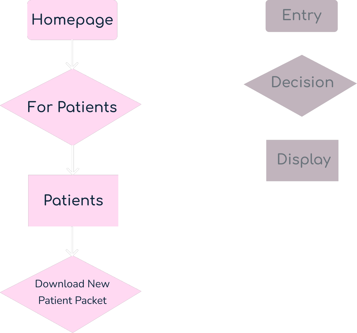
Patient User Flow

Bio
Age: 74
Occupation: Retired Teacher
Location: Meadville, PA
Scenario
Joan is a new patient referred to Retina Care Group. She wants to download and fill out the required forms before her first appointment.
Task Analysis
What prompts Joan to begin the task?
He receives a notification about a new retinal exam to review.
What tells her the task is finished?
She downloads and prints the “New Patient Packet” successfully.
What information does she already know?
She needs to complete paperwork before her visit.
What additional information does she need?
Where to find the forms and how to download them.
What tools does she need?
A computer with internet access and a printer.
Entry Point: Homepage
Success Criteria: Joan successfully downloads the New Patient Packet from the website and is ready for her appointment.
Task Flow
- Go to the Retina Care Group homepage.
- Click on “Patients” in the top navigation bar.
- Select “Patient Forms” from the dropdown.
- Click “Download” under the New Patient Packet.
- Open the downloaded PDF.
- Print the forms.
3
Ideation
Information Architecture
Site Map
Information Architecture
After gathering requirements for the design brief, along with insights from user research conducted through interviews and surveys, and a competitor analysis, I developed a list of key app features. These features were then grouped and structured into a site map.
Appointments
Physicians
Services
Clinicians
Patients
Site Map

4
Prototype
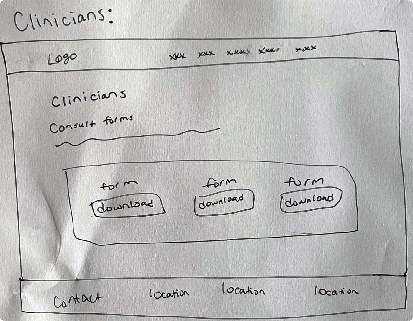
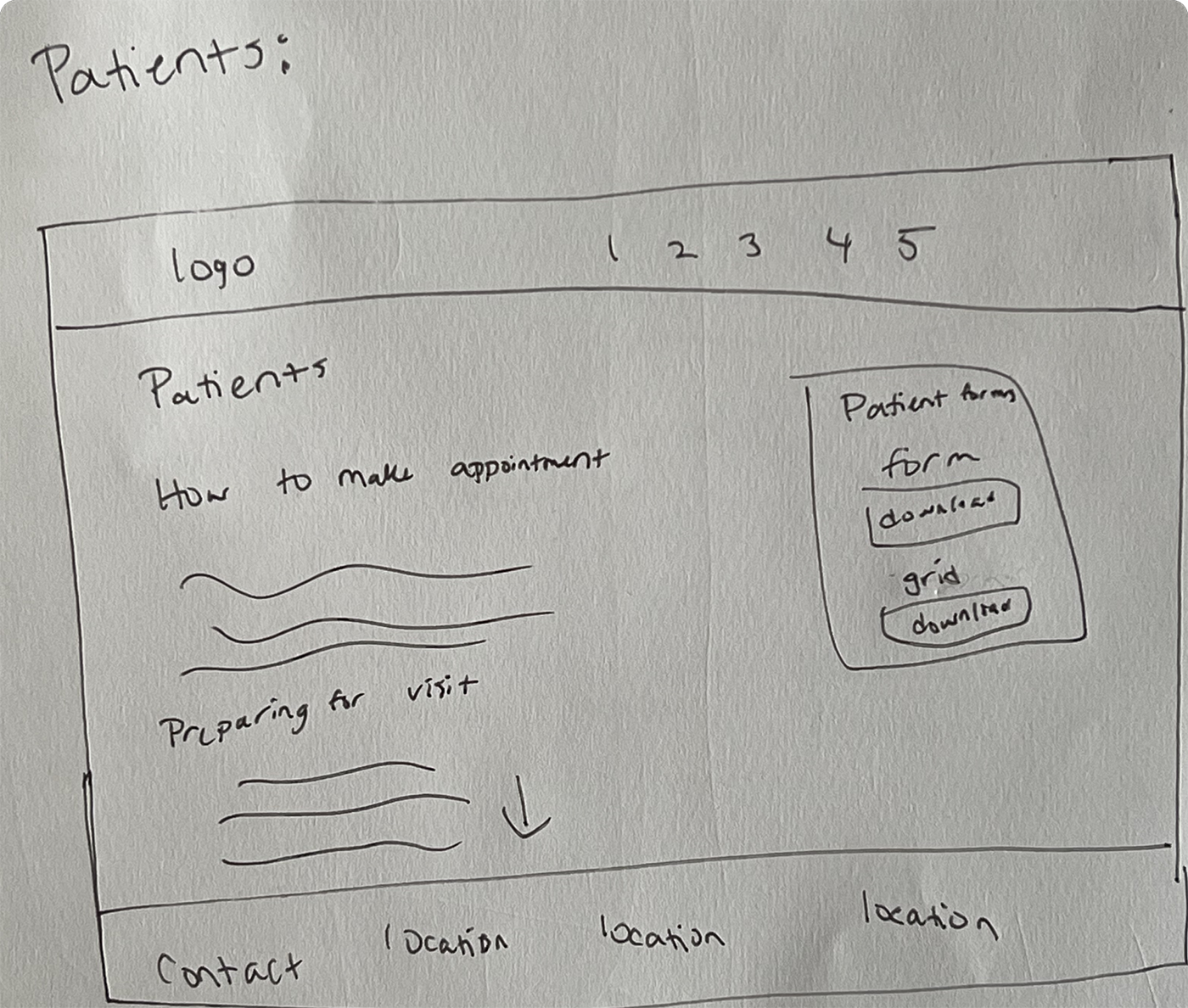
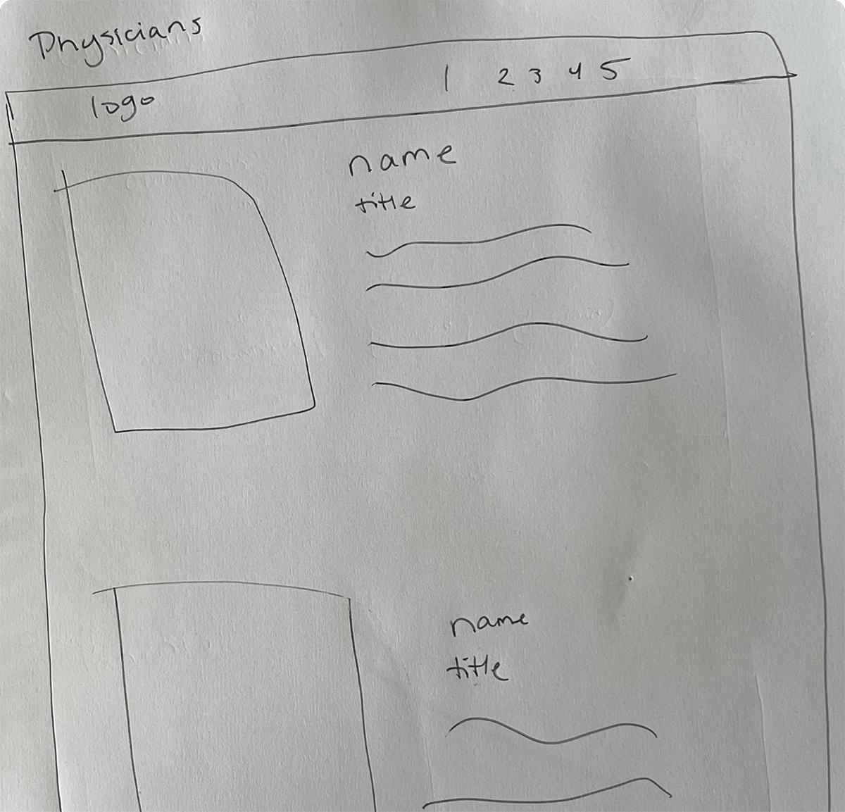
Low-Fidelity
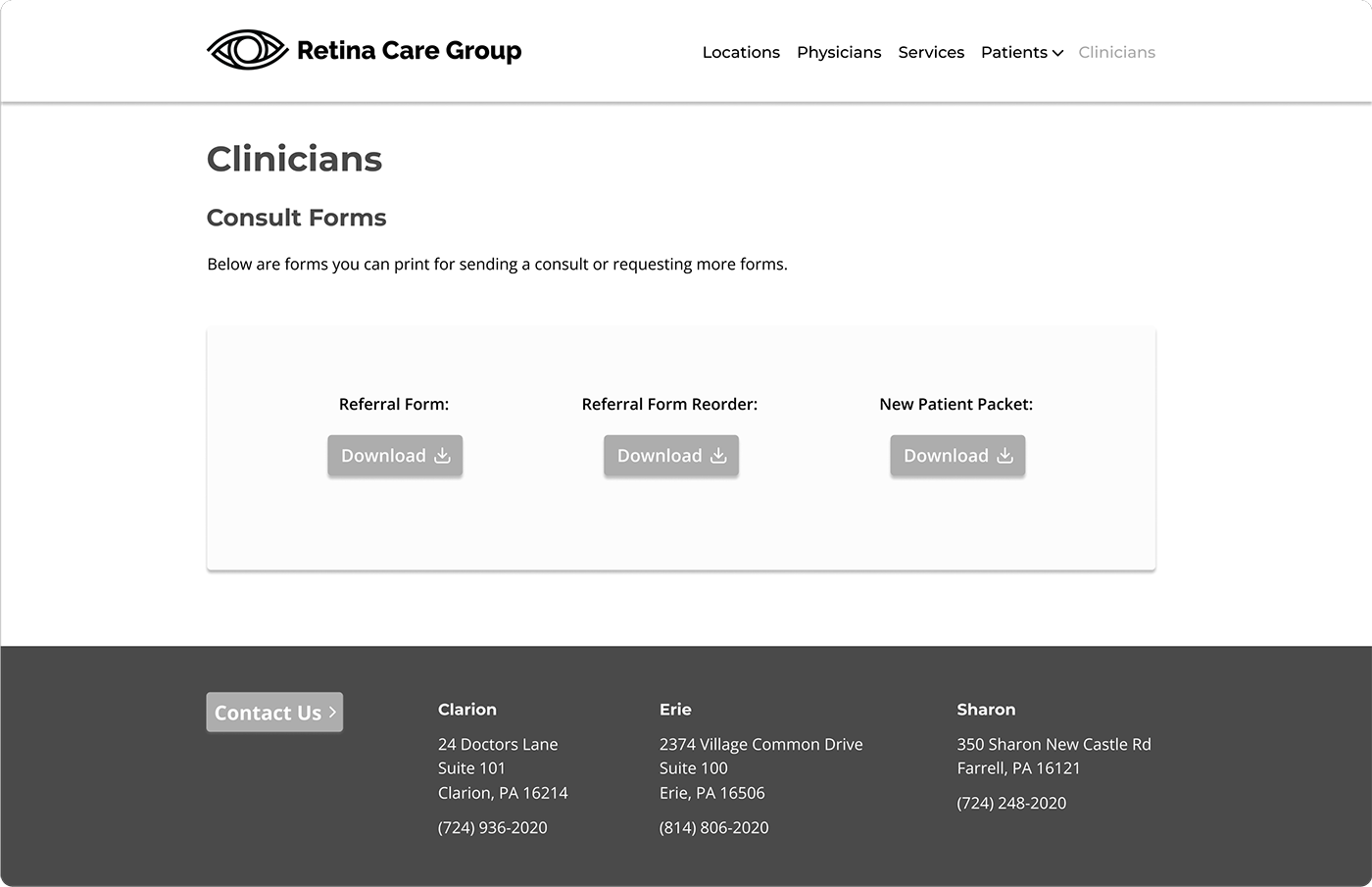
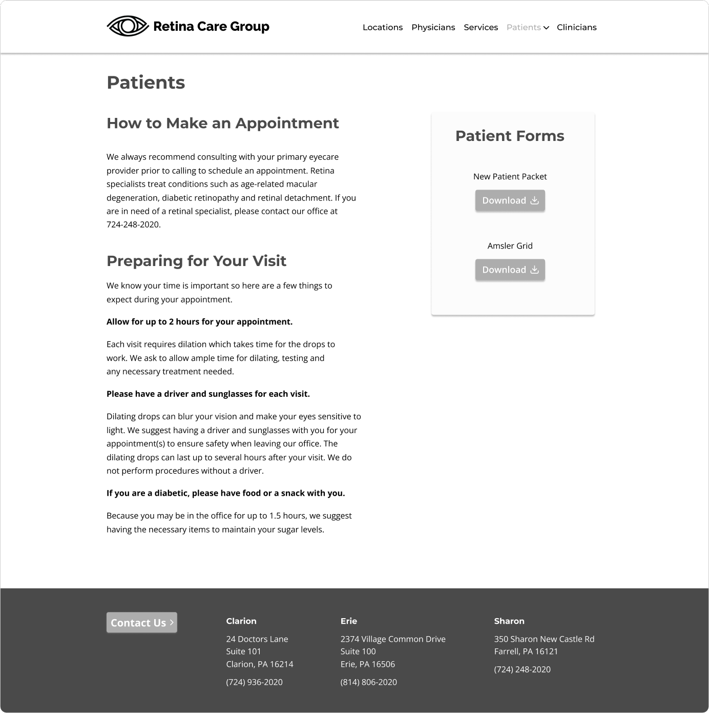
Mid-Fidelity
Low-Fidelity Wireframes
Mid-Fidelity Wireframes

5
UI Design
Final Screens
Clickable Prototype
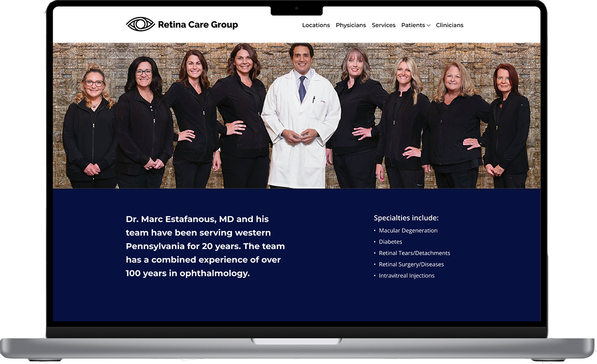
Final Screens
Homepage
Final Screens
Patients
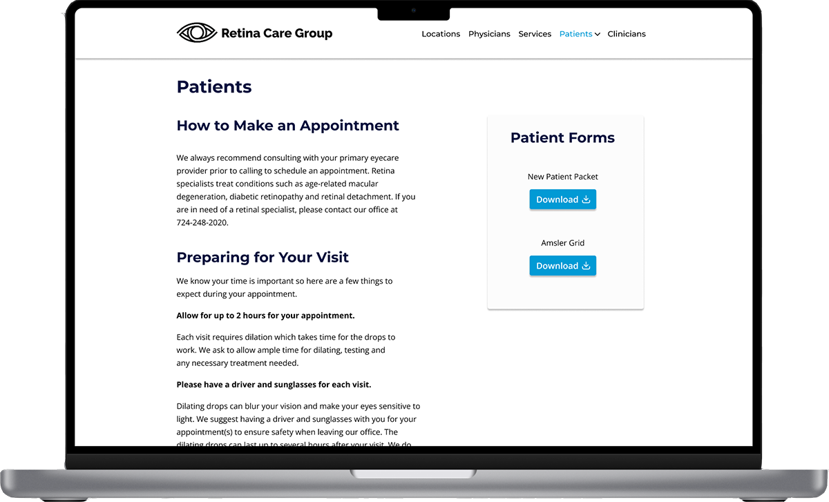
Final Screens
Education
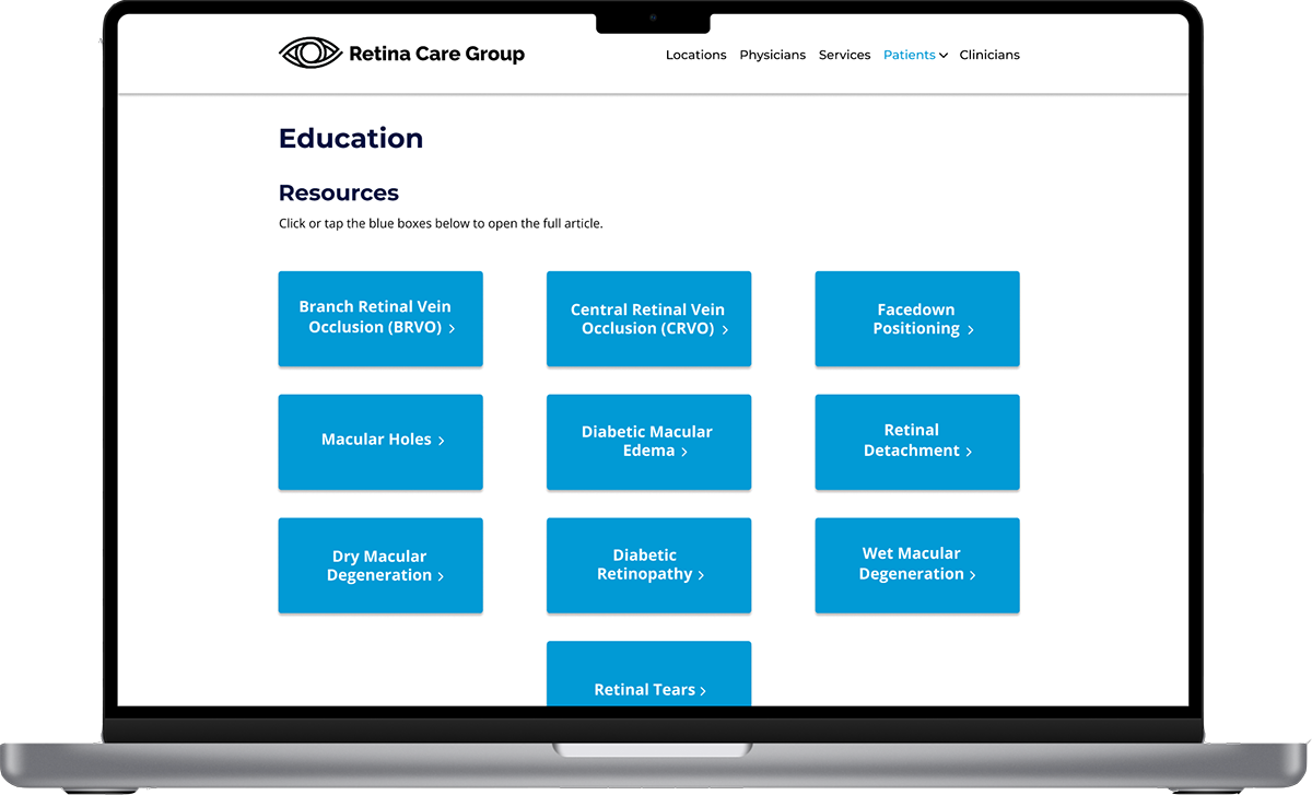
Clickable Prototype
Click around the prototype yourself here.

6
Reflections
Future Steps
Lessons Learned
Future Steps
With the website complete, here are the next steps to bring the site to its full potential:
User Testing
Conduct usability testing to gather insights on the current design and identify areas for improvement.
Refine Designs
Incorporate feedback from testing to enhance user experience and optimize functionality.
Lessons Learned
During the Retina Care Group design process, I encountered key challenges:
Designing for Older Adults
Creating accessible and user-friendly interfaces to accommodate visual impairments, limited tech familiarity, and diverse physical abilities.
Streamlining Medical Form Completion
Simplifying multi-step forms to reduce frustration and minimize errors, while maintaining HIPAA compliance.
Optimizing Cross-Device Usability
Ensuring consistent and intuitive user experiences across smartphones, tablets, and desktop devices to accommodate varying preferences.