Insight Optics
Designed a web app for doctors to upload and review eye exam images, with integrated AI to assist in analysis and streamline specialist feedback.
About
Internship
My Role
UX Designer
Time
3 months full-time
Tools
Figma

Zoom
Google Forms
ChatGPT

The Background Story
Insight Optics emerged to address the need for better access to early retinal screenings, which can prevent blindness. Many primary care providers lack the tools to offer these screenings, leading to missed opportunities for early detection.
What is Insight Optics?
Insight Optics enables primary care providers to record retinal exams with their existing equipment and easily refer patients to specialists.
Design Process
1
2
3
4
Design thinking is not a linear process, and any stage can feed back to another e.g. after user testing, I often go back to prototyping based on insights
7
6
5
1
Discovery
Survey
Interviews
Survey and interview research goals
Goal 1
Documenting user pain points in interneuro relationships
Goal 2
To evaluate how providers respond to summarized AI-picked images
Goal 3
To understand physician preferences for navigating between pages in the app
Goal 4
To determine what features and content are important to users
Goal 5
Collecting information on how users prefer to input medical data
Survey
I conducted a survey via Google Forms to better understand physicians’ workflows, frustrations, and preferences when reviewing retinal exams using the Insight Optics platform. The responses helped prioritize layout adjustments, input methods, and image placement in the redesigned interface.
20 Survey participants
65% of survey participants are specialists
2.6/5
Many users described the layout as “disorganized” or “cluttered,” and cited frustration with scrolling back and forth between information.
Survey
90%
75%
85%
Interviews
I conducted an interview with a specialist to understand more about doctor’s pain points in using the current interface and their preferences towards fixing them.
4 Interview participants
100% of interview participants are physicians
Pain Points
Too much typing required
Exam layout feels disorganized
Notes are too far from images
Importing patients is confusing
Video is prioritized over still images
Preferences
AI-picked images shown first
Images and findings side-by-side
Dropdowns and premade templates
Reminders for incomplete reviews
Single navigation system
2
Understanding User Needs
User Personas
User Flow
User Personas
Use the arrow or click a persona card to view the next one
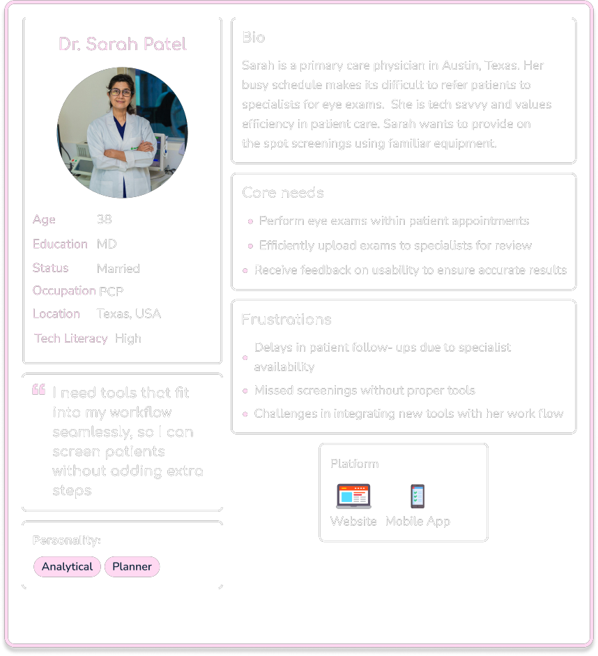
Dr. Green User Flow

Bio
Age: 45
Occupation: Opthalmologist
Location: NYC, USA
Scenario
Dr. Green needs to review patient retinal exams efficiently to deliver timely diagnoses. He prefers tools that allow quick access to key images and annotations, helping him keep up with his workload without compromising quality.
Task Analysis
What prompts Michael to begin the task? He receives a notification about a new retinal exam to review.
What tells him the task is finished? Submitting the review and feedback to the primary care provider (PCP).
What information does he already know? He knows how to access assigned exams and navigate the app.
What additional information does he need? How to annotate effectively and confirm submission.
What tools does he need? His computer, internet access, and Optoview login credentials.
Entry Point: Login/Sign Up
Success Criteria: The annotated review is successfully submitted, and PCP receives confirmation.
Task Flow
- Log in to the Optoview app.
- Access new exams from the notification center.
- View the stitched retinal images.
- Annotate key areas in the exam.
- Submit the annotated review.
- Confirm the submission is successful.

3
Ideation
Information Architecture
Site Map
Information Architecture
After gathering requirements from the design brief, along with insights from user research conducted through an interview. I developed a list of key app features. These features were then grouped and structured into a site map.
Inviting colleagues
Patients
Exams
AI Image Selector
Profile
Site Map of Insight Optics

4
Prototype
Low-Fidelity
Mid-Fidelity
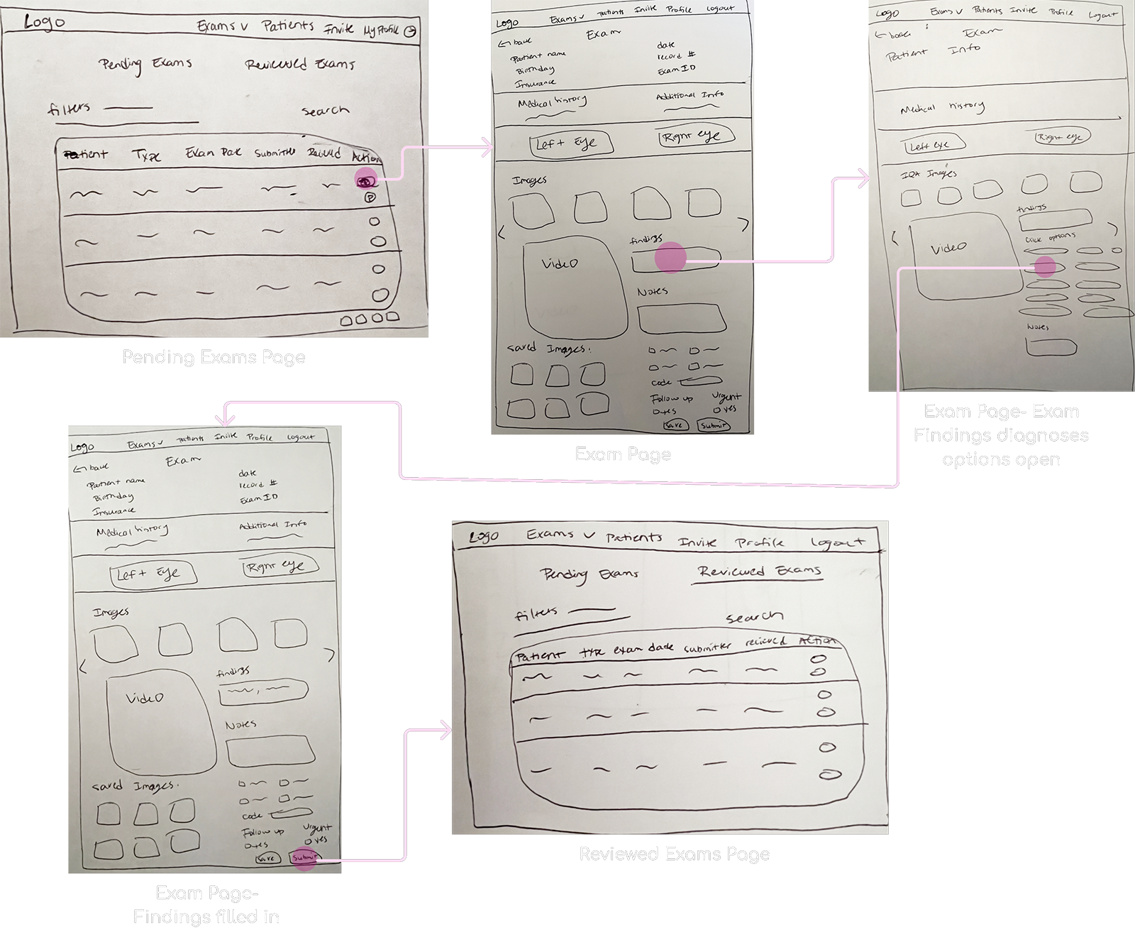
Low-Fidelity Wireframes
Task Flow - Review Eye Exam
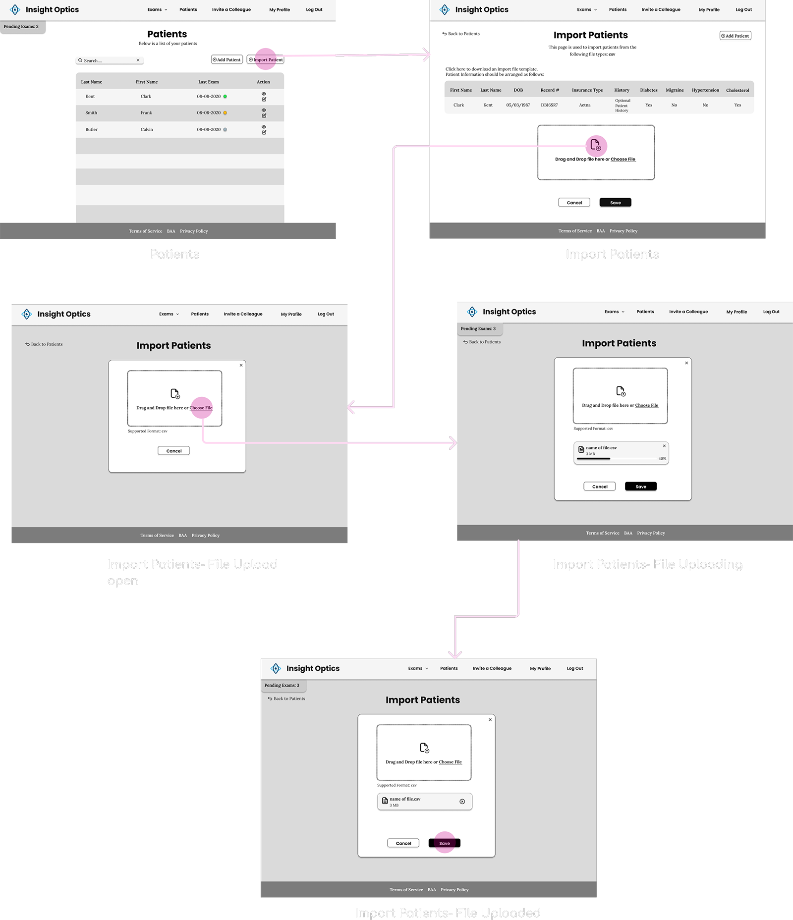
Mid-Fidelity Wireframes
Task Flow - Import Patients
5
User Testing
User Testing Interviews
User Testing Interviews
I conducted 2 user testing interviews via zoom with specialists to explore how individuals interact with the app and identify pain points in its usability.
Below are some surprising findings from these sessions.
What's working
Structured inputs significantly improved speed
P1, P2
Navigation was more intuitive than the original design
P1, P2
AI-selected images were trusted as a useful starting point Physicians cross-checked the suggestions, but found them time-saving
P1, P2
Needs work
Image placement still preferred next to input selection
P1, P2
Note: Due to internal constraints, this layout change was not approved for the current release.
Exam submission wasn’t clearly communicated Participants clicked “Save” but were unsure if their review was submitted.
P1, P2
Video was ignored or seen as unnecessary Users continued to rely solely on static images.
P1, P2
6
UI Design
Final Screens
Final Screens
Exam Review Page
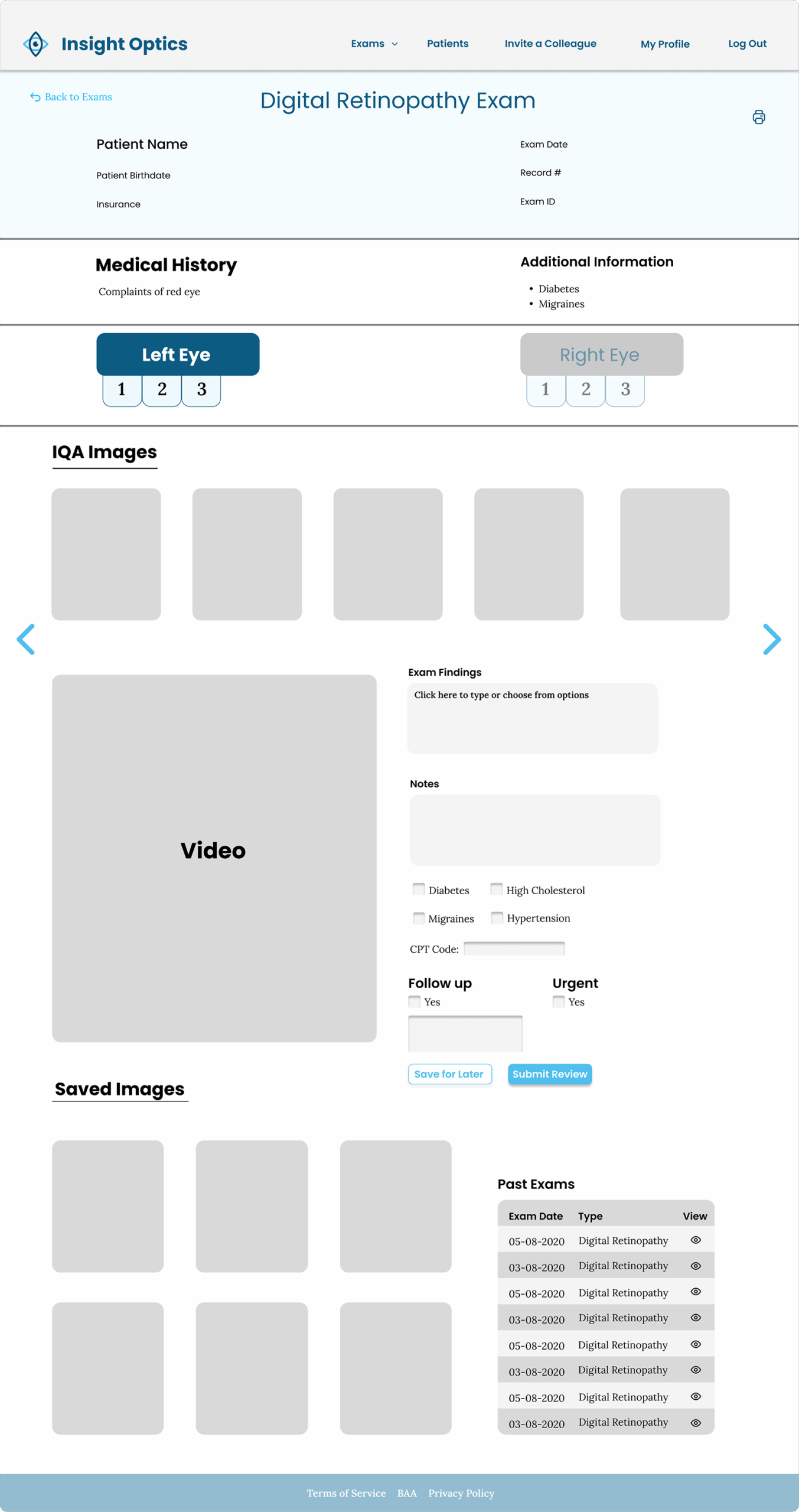
Final Screens
Import Patients
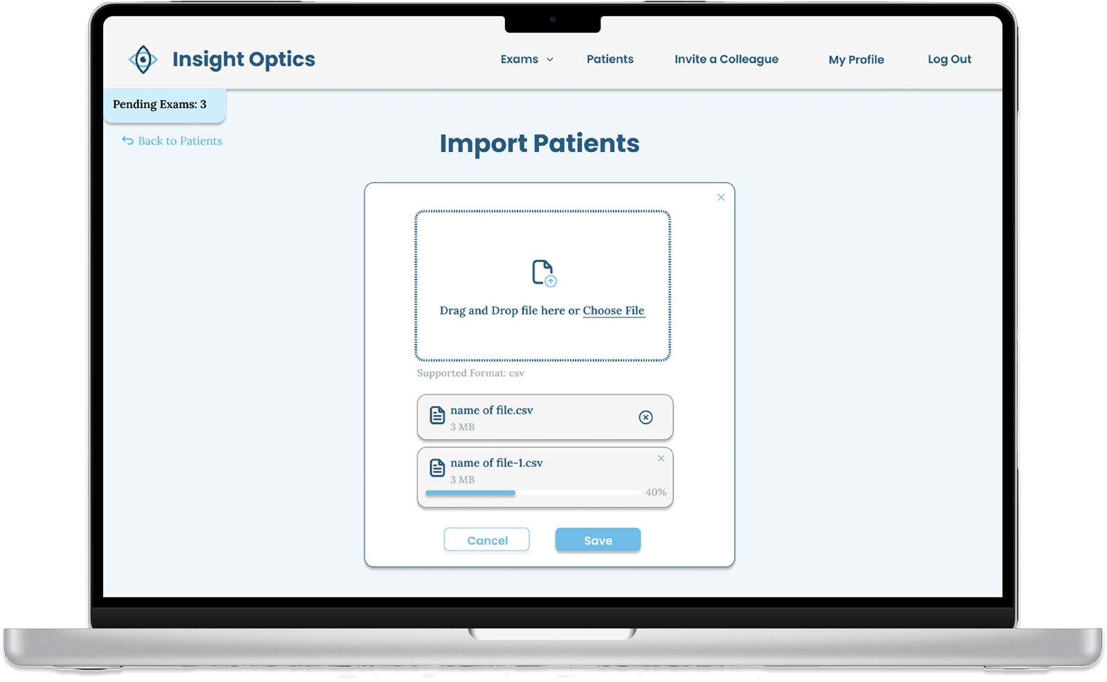
Final Screens
Invite a Colleague
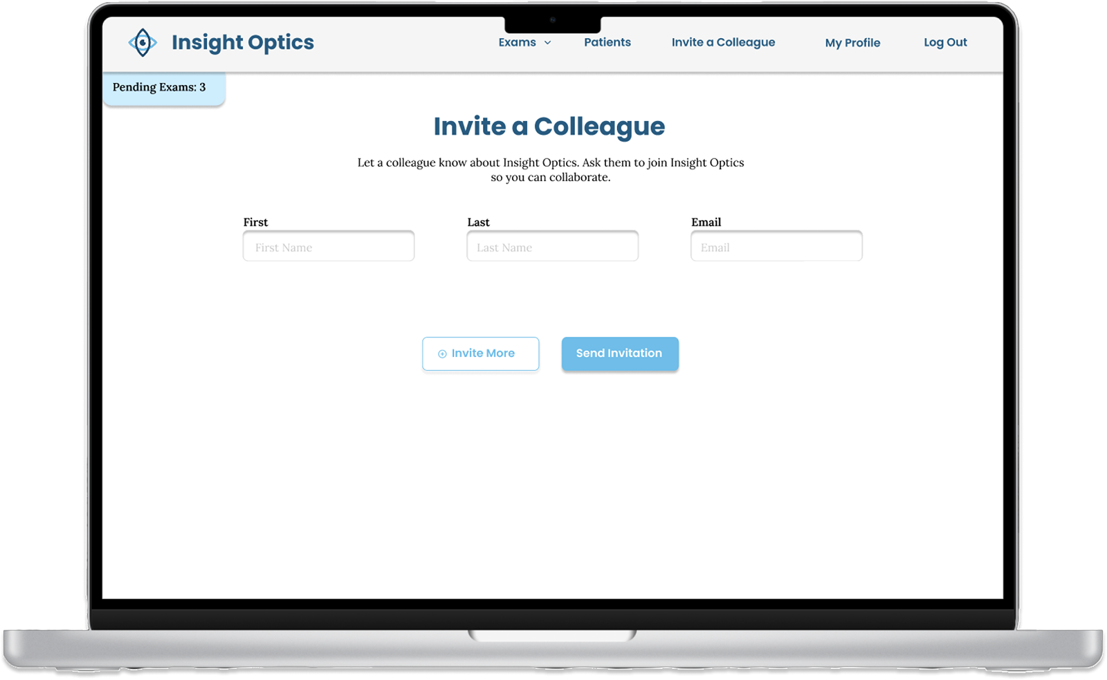
7
Reflections
Lessons Learned
Lessons Learned
During the Insight Optics design process, I encountered key challenges:
Balancing Aesthetics and Functionality
Designing the exams page taught me the importance of a clean, intuitive layout to balance visual appeal with usability.
Streamlined Input for Efficiency
Developing the diagnosis input system showed that compact, thoughtful design is essential for ease of use, especially with lengthy information.
Navigating Limited Research Access
Limited access to doctors emphasized the need for adaptable user testing approaches.
Advocating for User Needs
Learned to balance CEO preferences with user-centric design principles, especially around login/signup experiences.